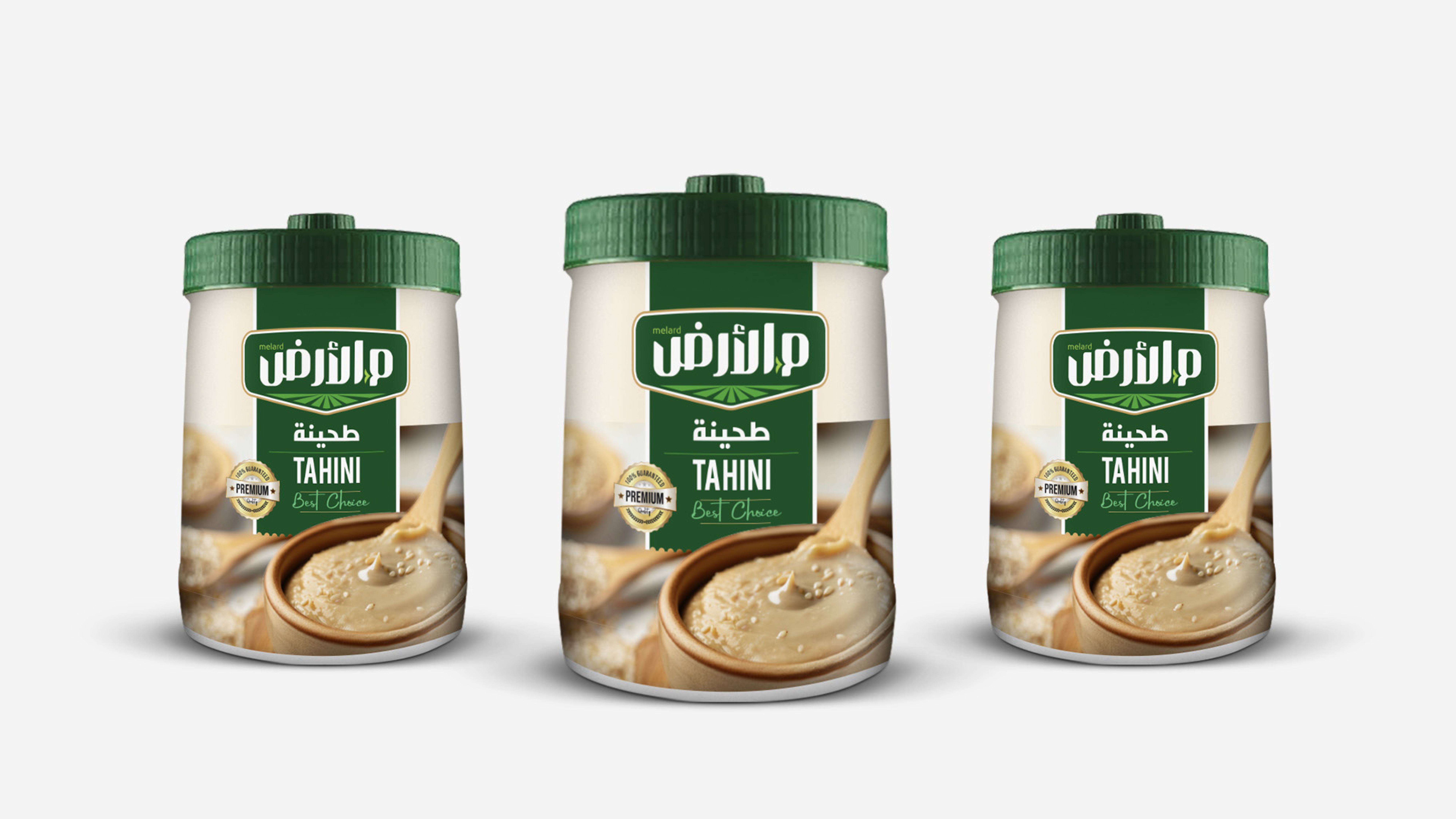
We are excited to share our new project, the brand “Mel-Ard,” which we developed literally from scratch at Lasheen!
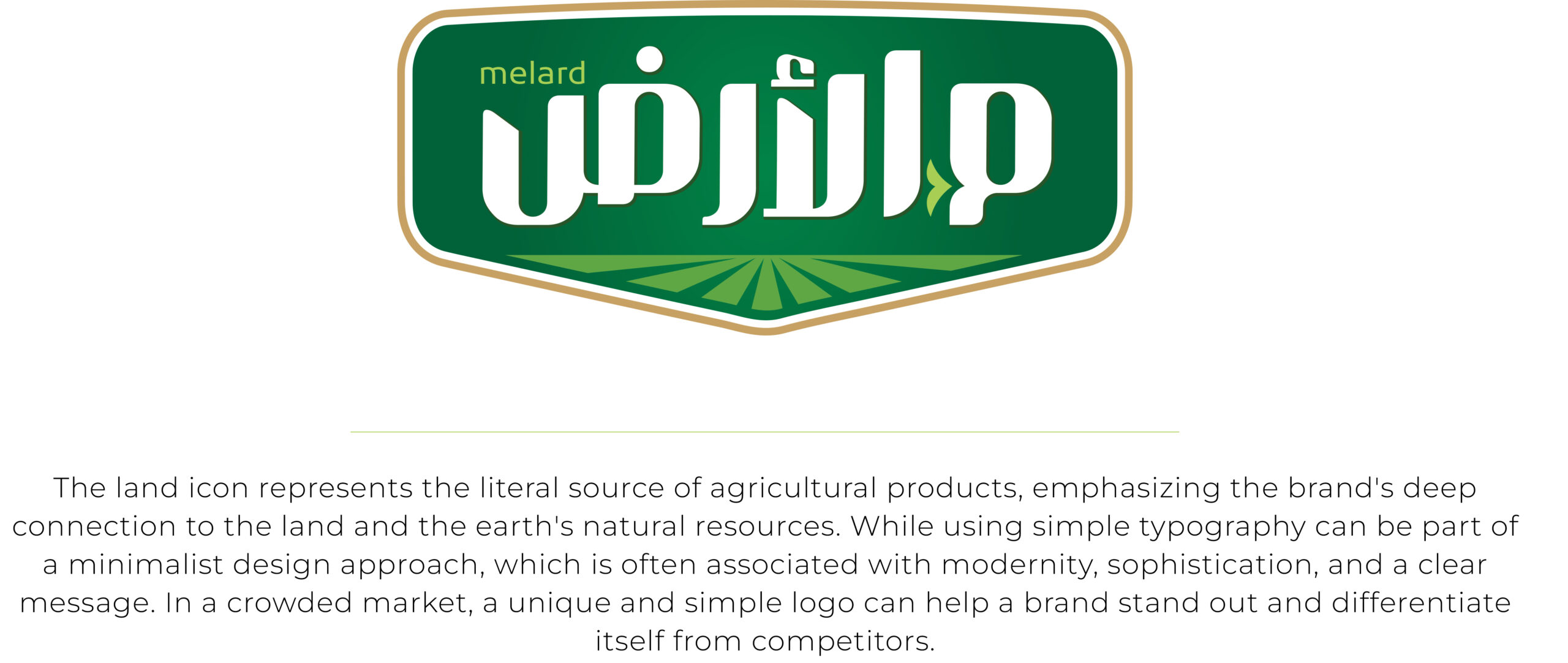
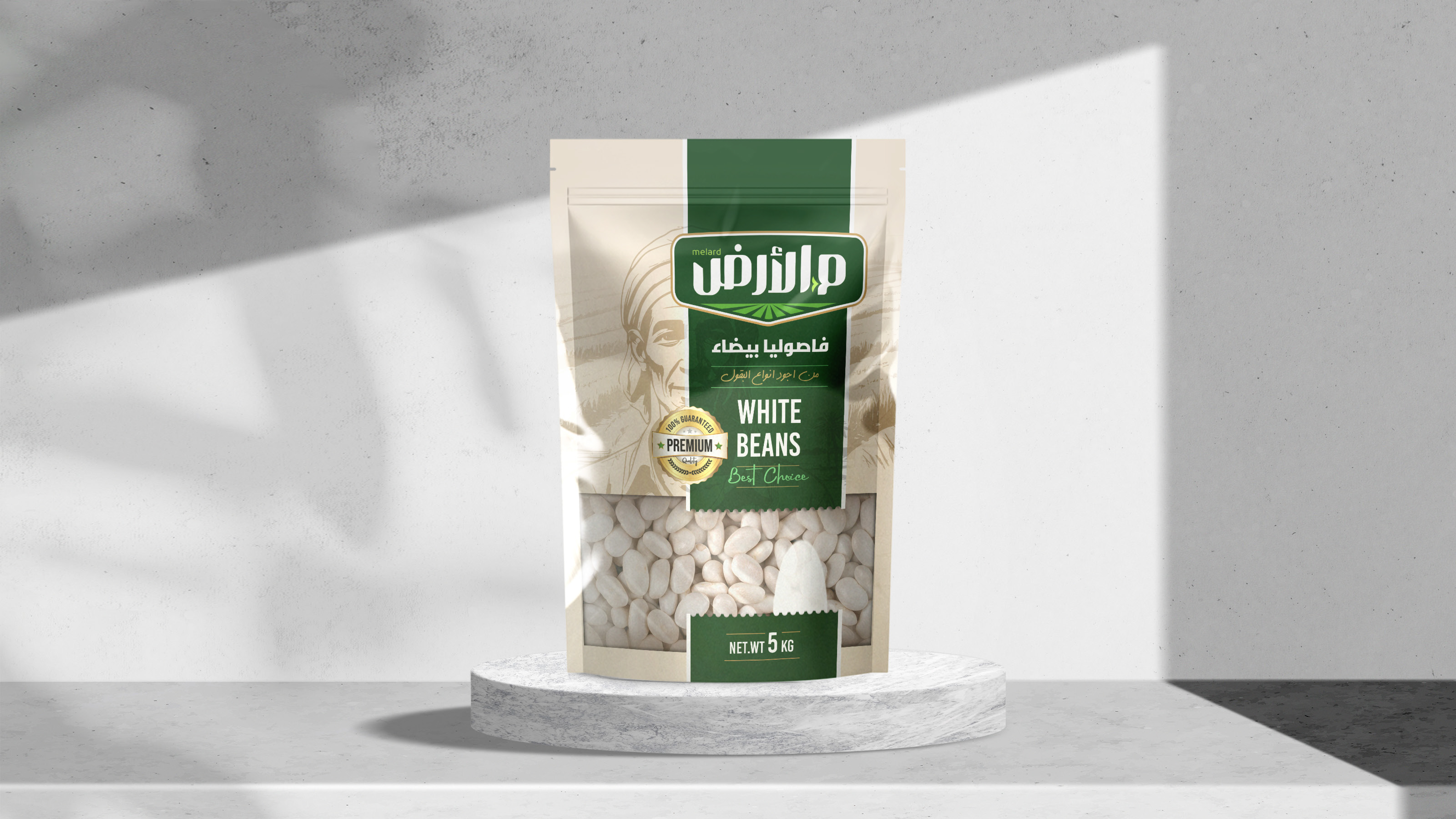
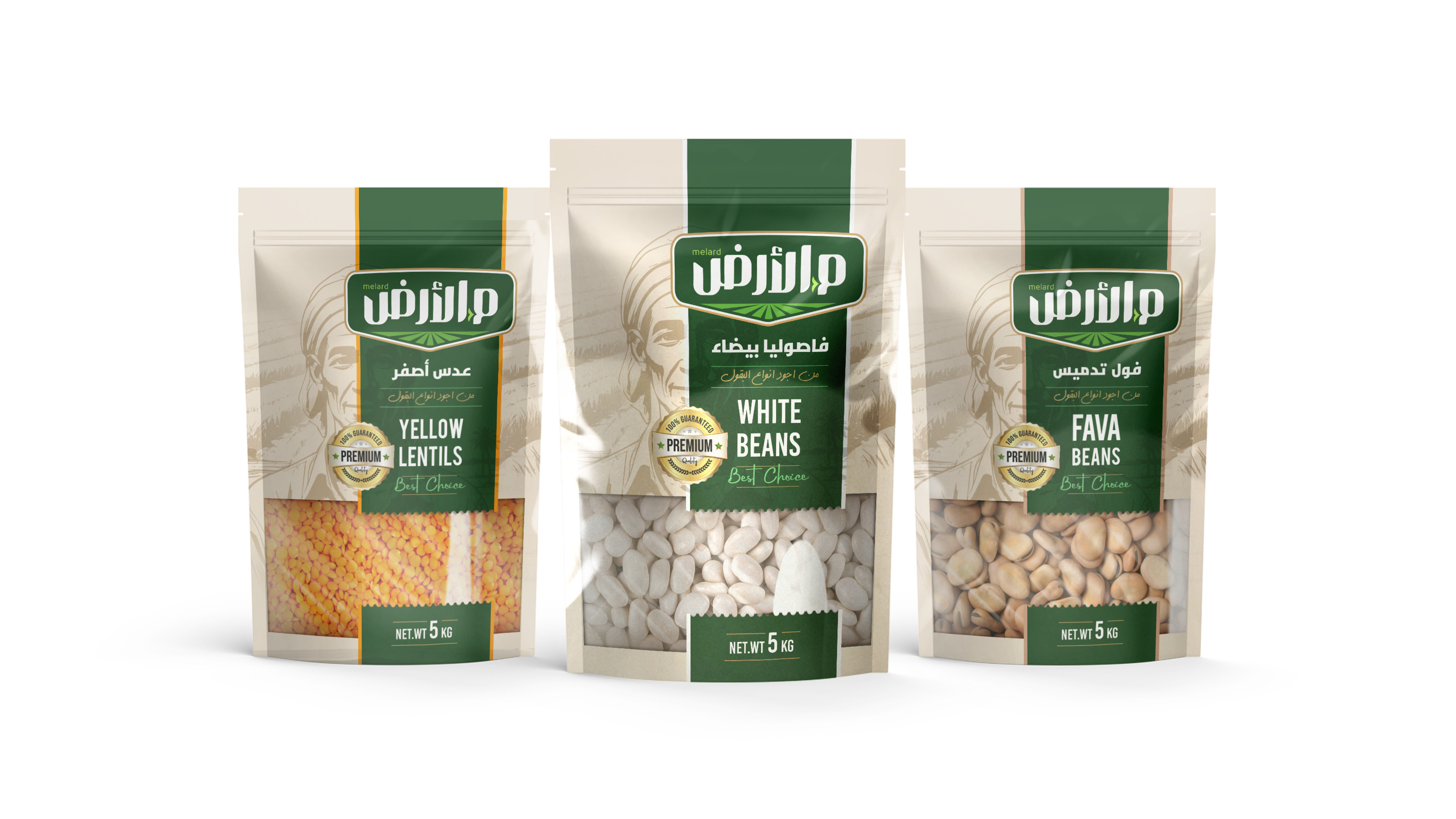
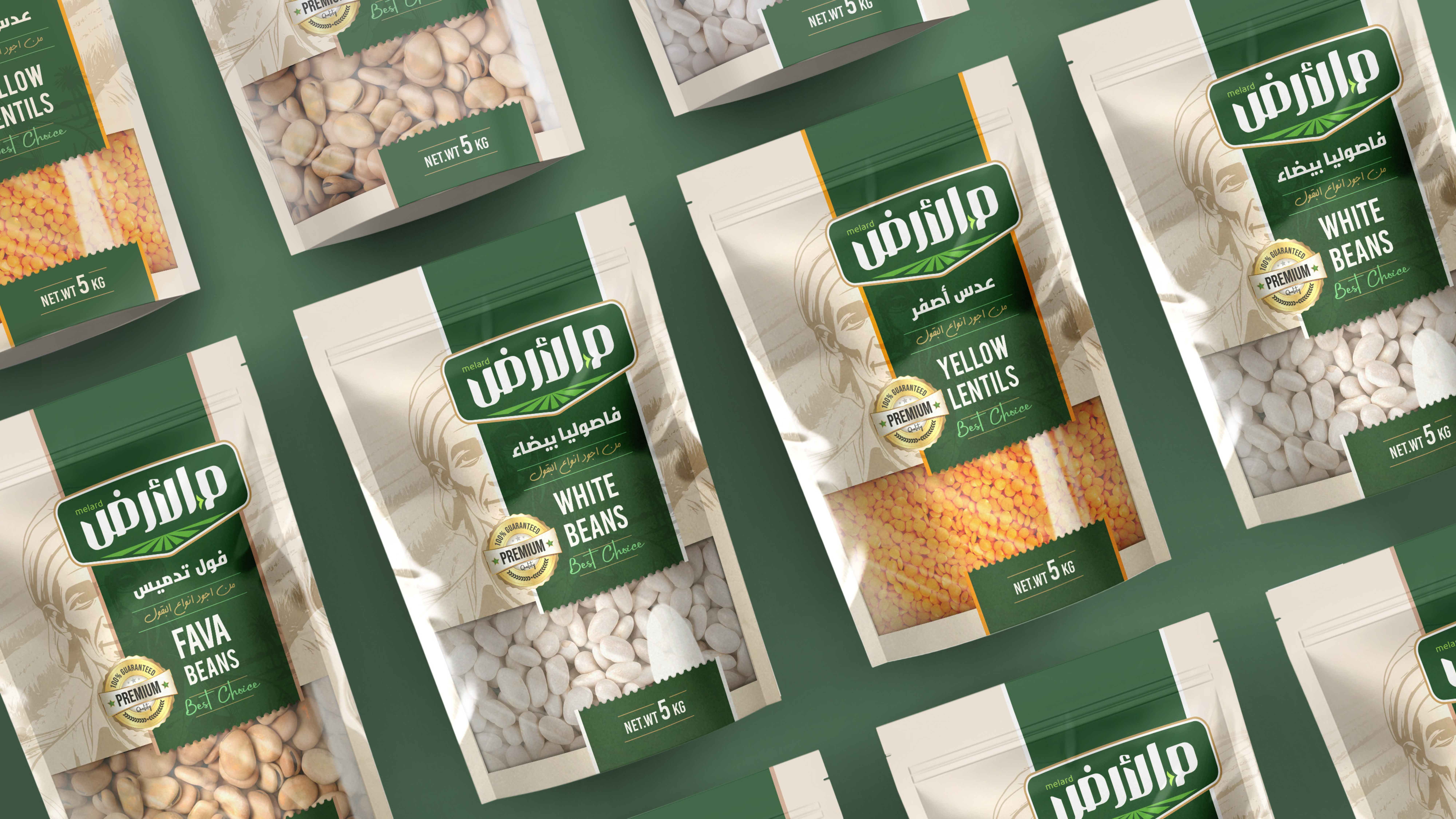
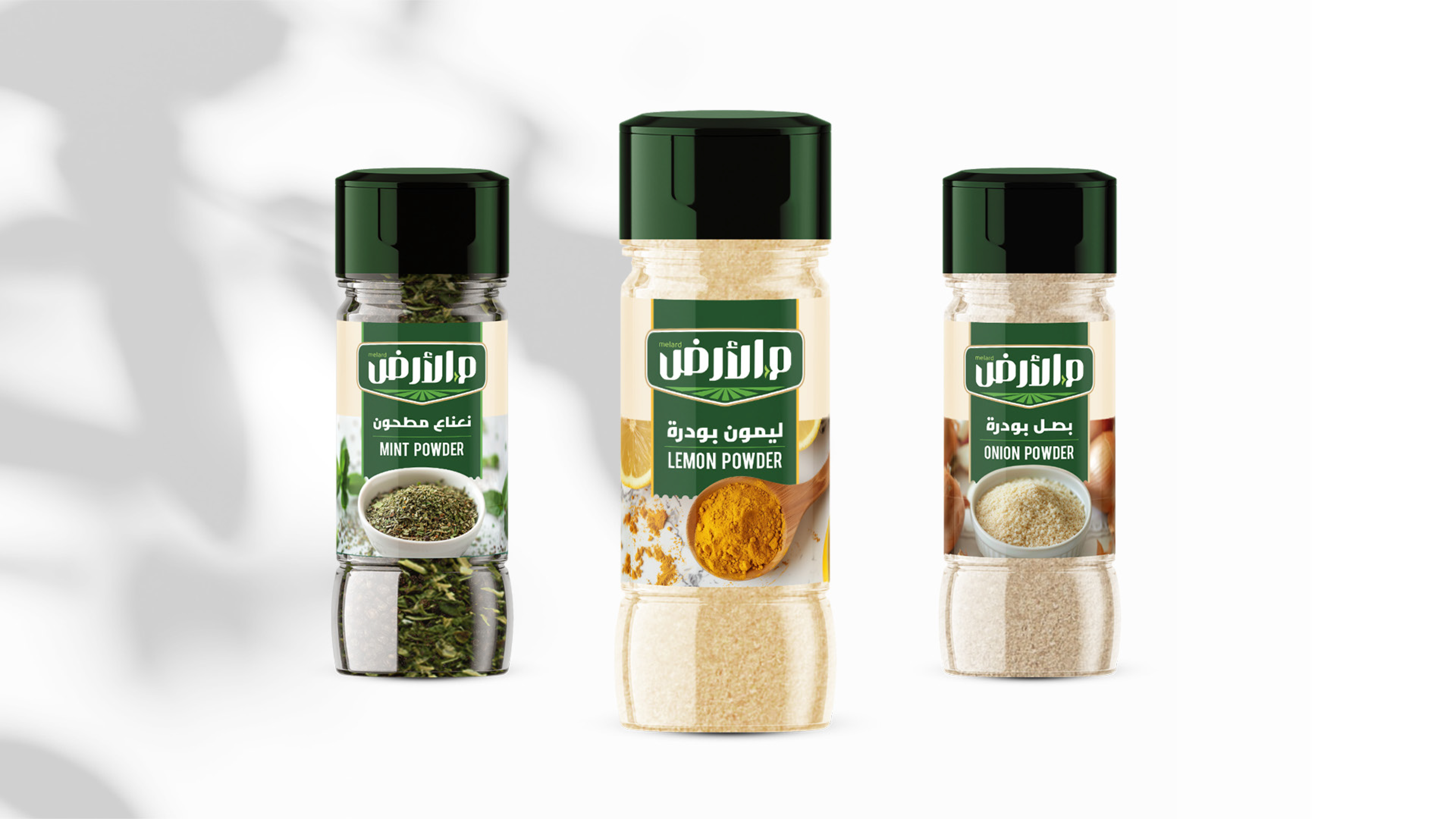
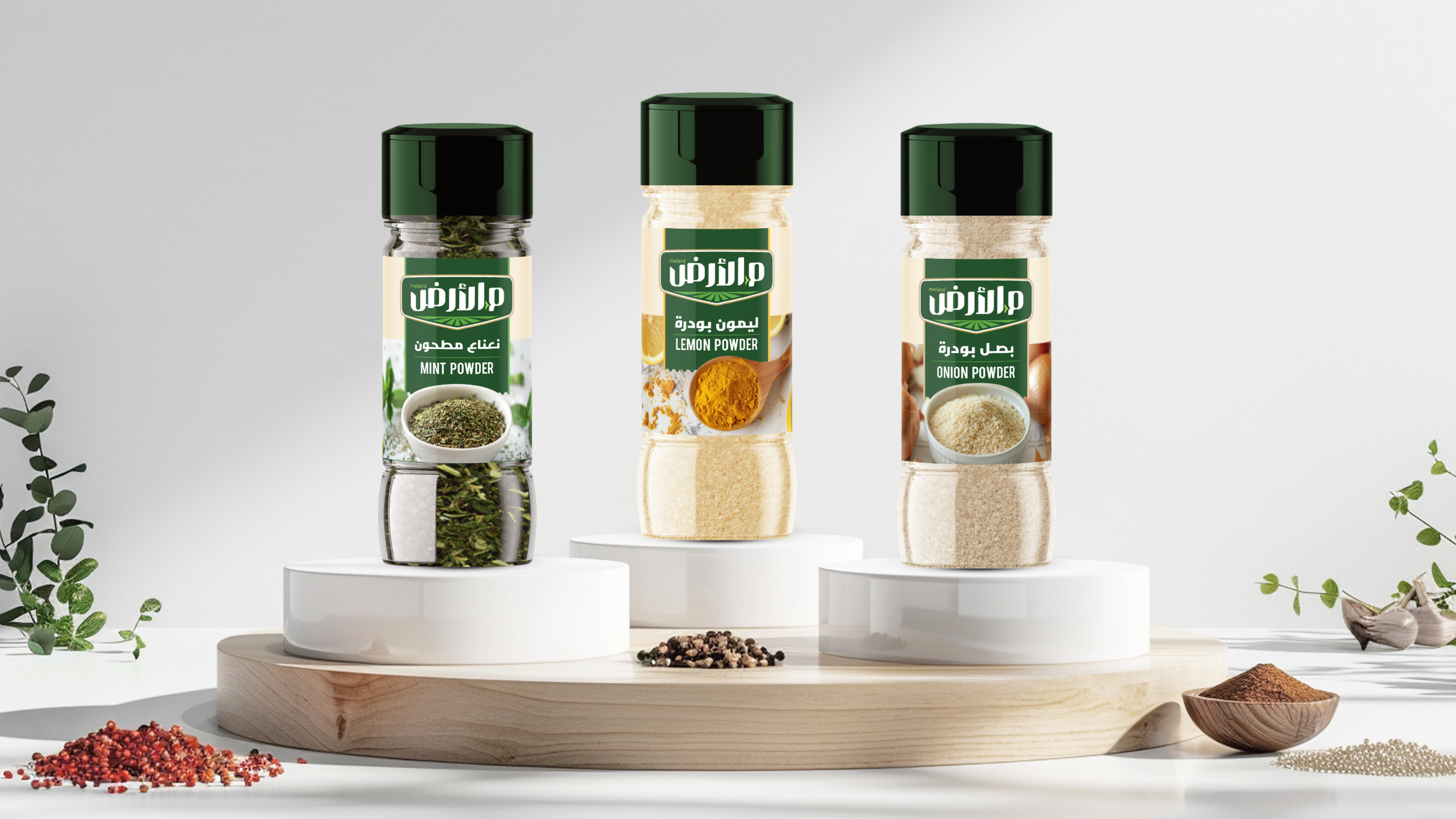
We started by creating the name (which means from ground on Arabic) and worked on the logo, brand look, and packaging design.
The logo needed to be clear and strong as it reflects that the products are grown in the customer’s land and are 100% natural.
We also aimed to create a transparent space in the packaging of the legumes to showcase the quality of the product, which instills trust in the buyer.
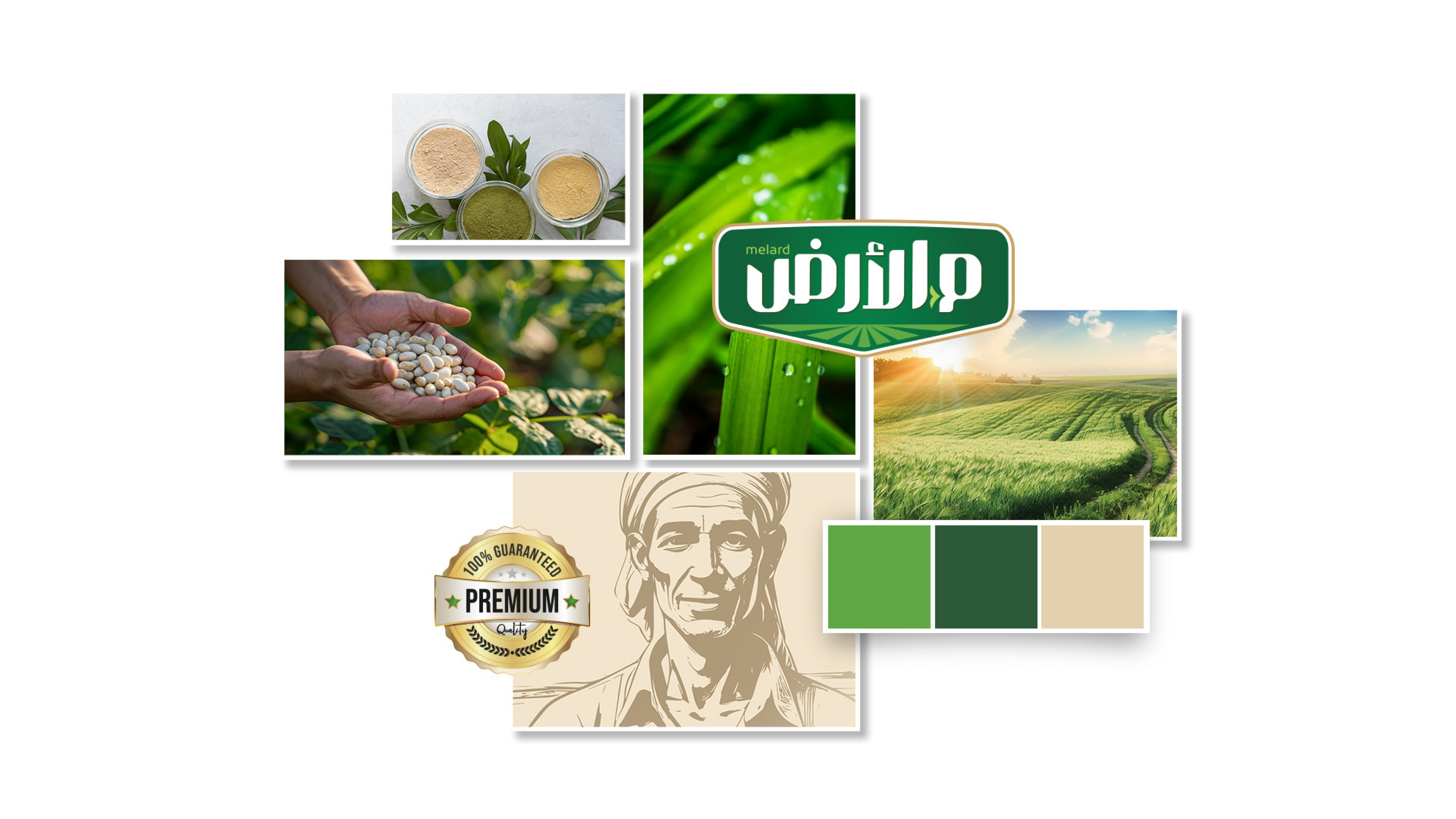
In the background of the design, we illustrated a farmer—not overly emphasized—as a symbol representing the one who cultivates and harvests the crops from the land.
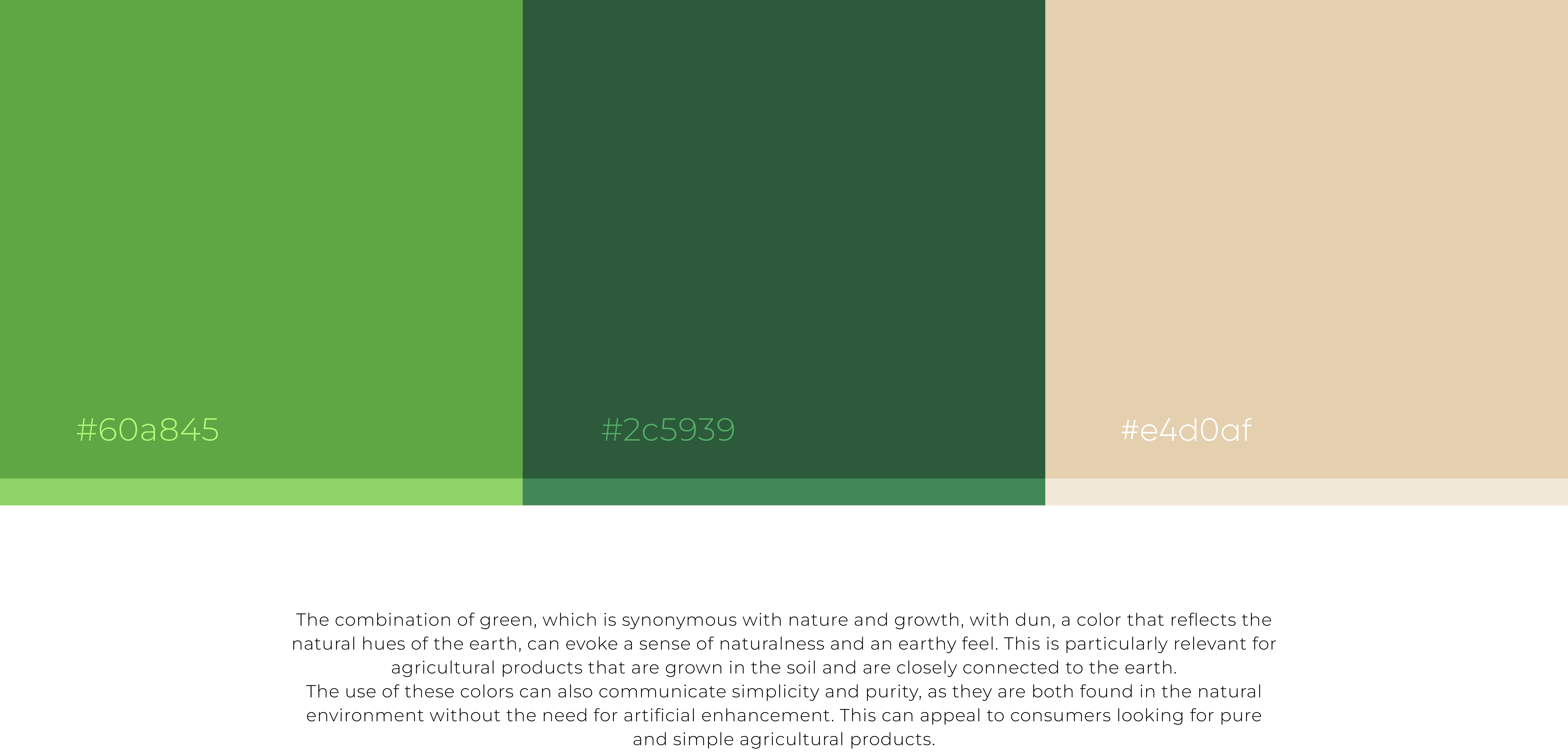
The choice of green was intentional, signifying a double meaning: it represents agriculture and is also a color that resonates with Saudi culture as the brand owned by a client from the Kingdom of Saudi Arabia.
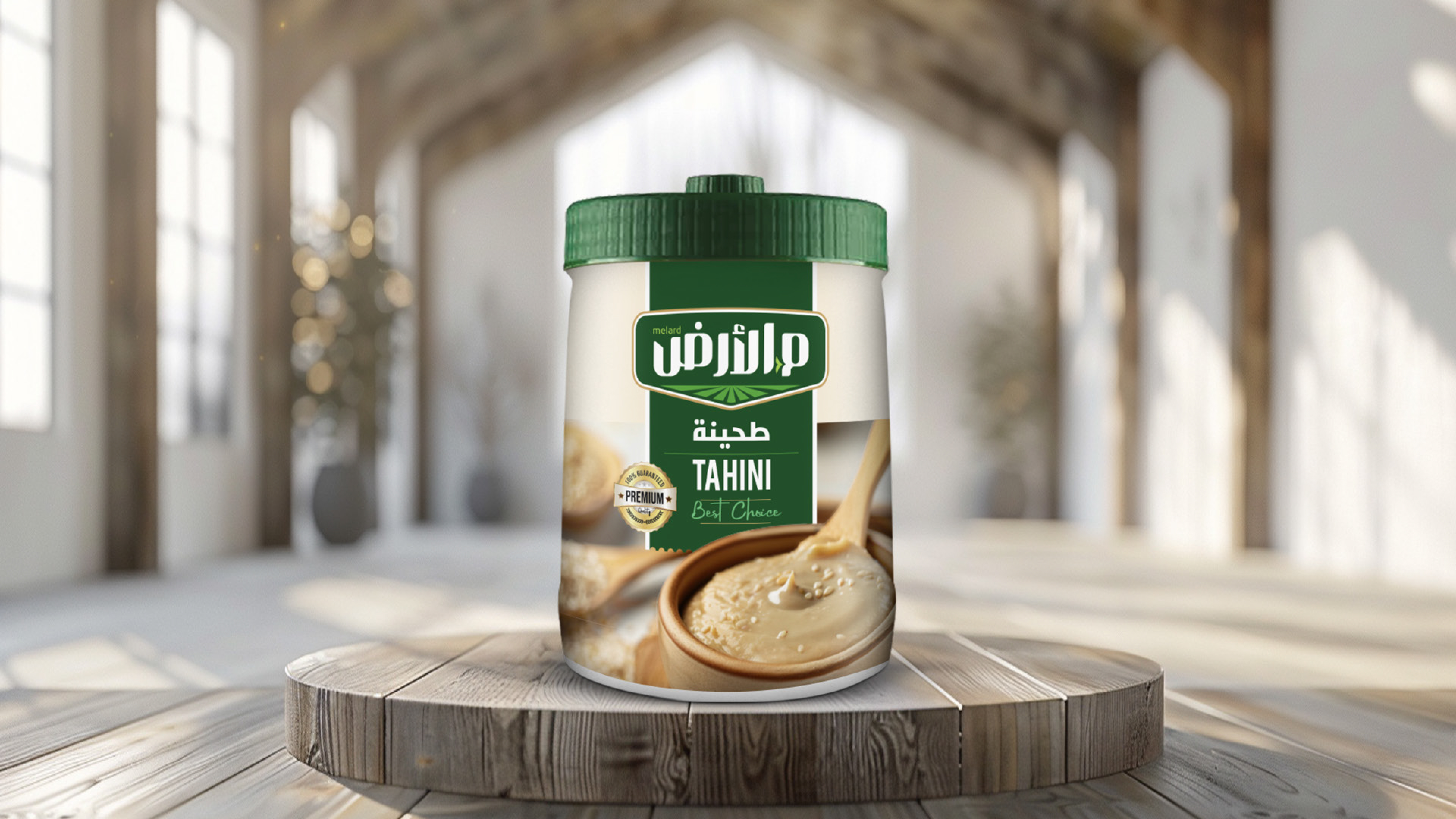
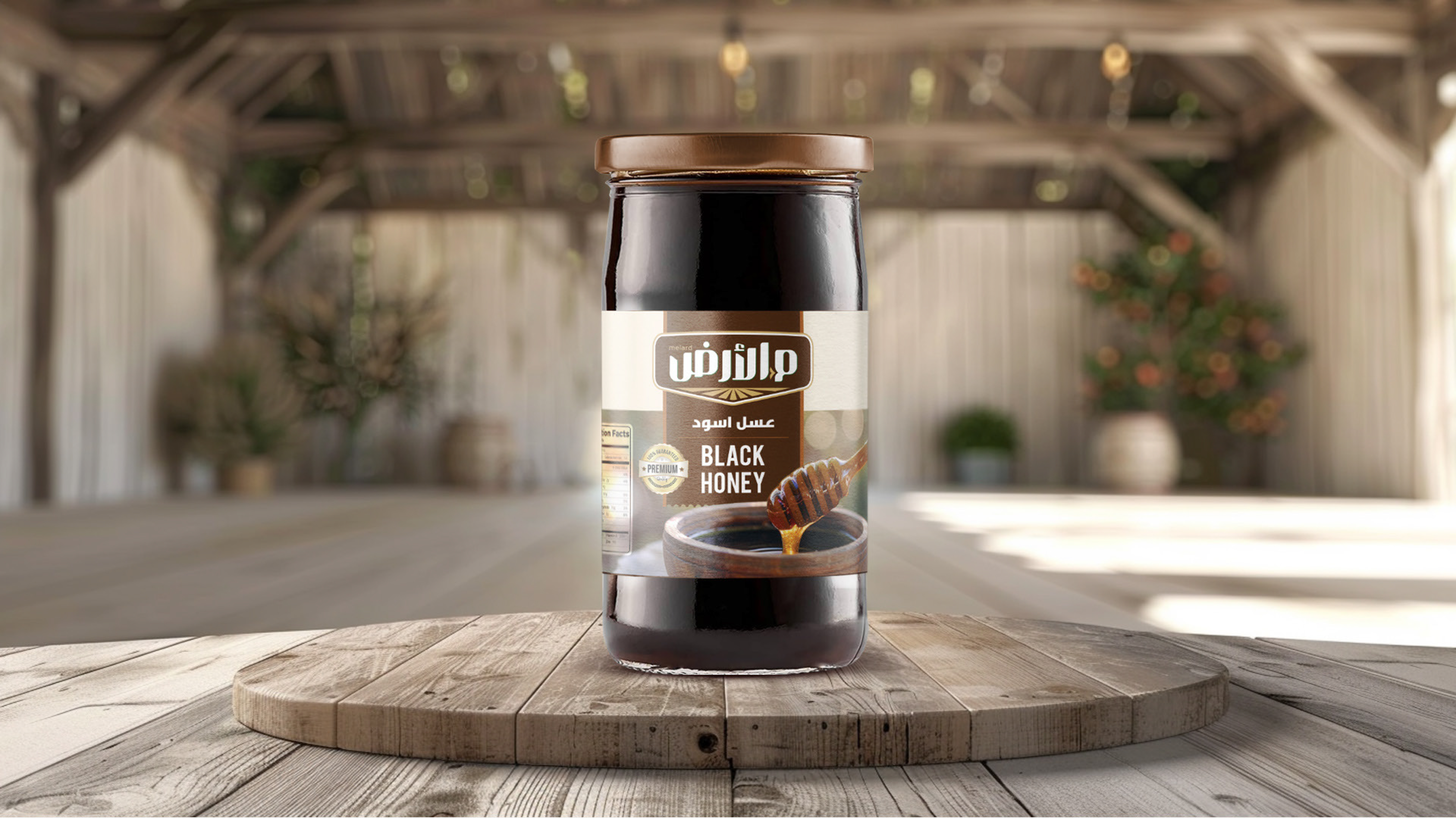
We completed the project with additional products such as spices, honey, and tahini, while maintaining the core identity and brand guidelines.
