At Lasheen, we’ve learned that when the entire market is moving in one direction, you don’t have to follow it.
For Dajaji, we set out to create a brand with its own personality and presence.
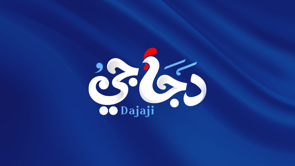
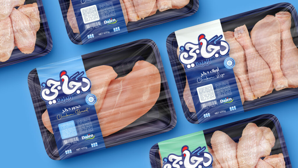
We started by designing a fully custom Arabic logotype from scratch not using an existing font, but crafting unique letterforms that give the brand a distinctive visual signature.
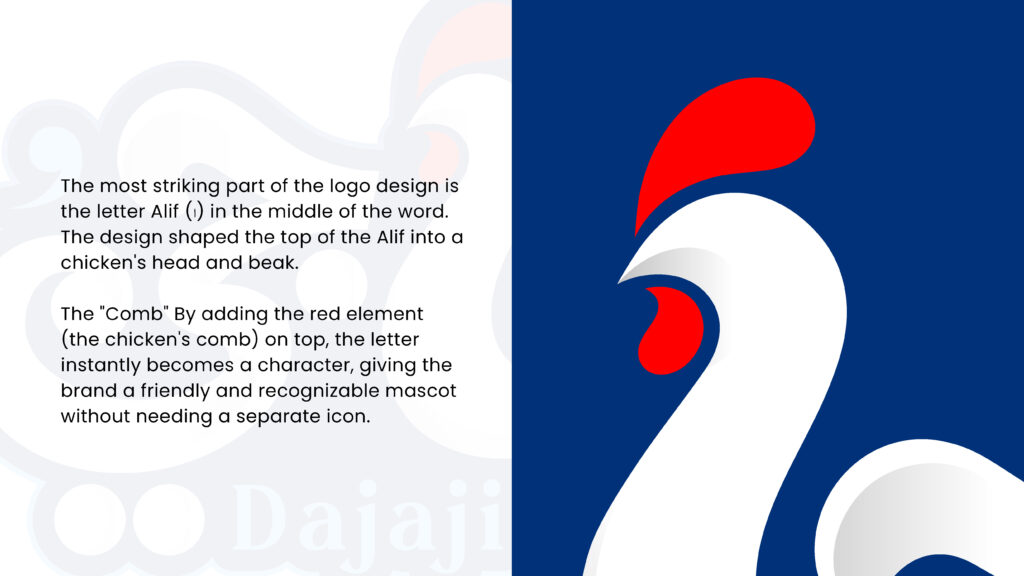
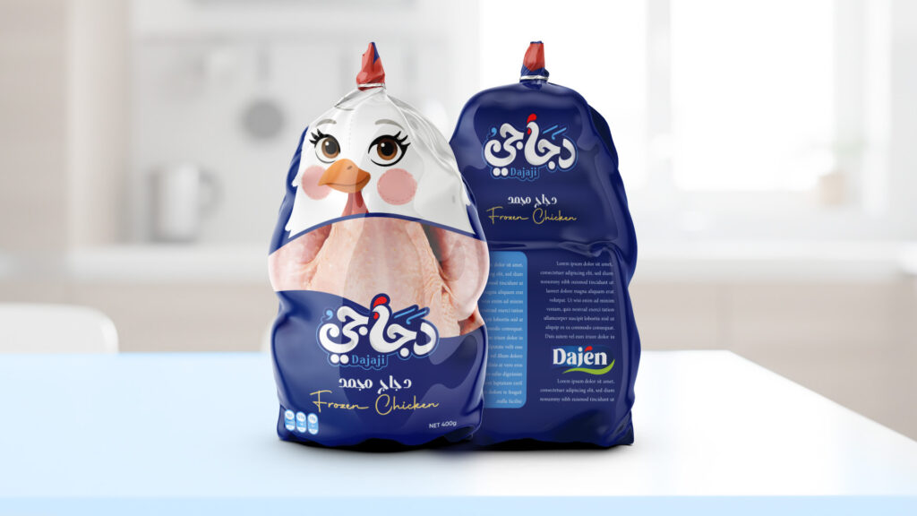
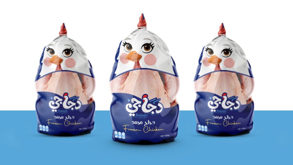
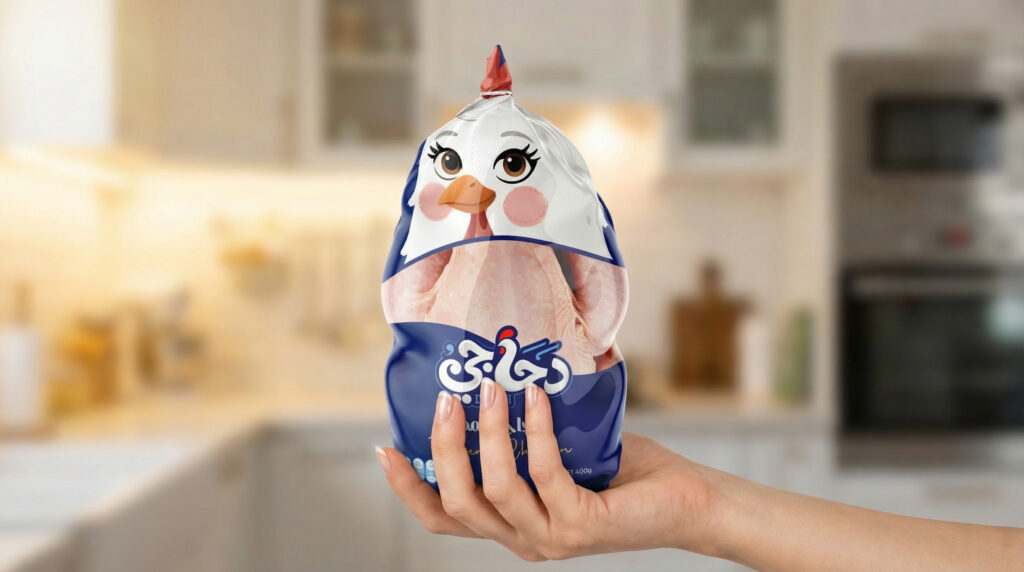
From there, we transformed the relationship between the two Arabic letters “ج” and “أ” into a simple chicken character, creating a memorable Brand Icon that people can instantly recognize, even without reading the name.
When it came to color, we made a deliberate choice.
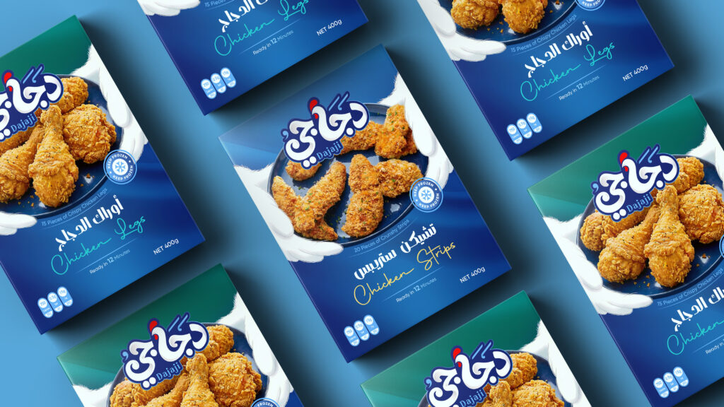
Instead of following the category norms, we introduced a blue gradient that communicates cleanliness, quality, and trust, while giving the brand stronger shelf visibility.
In a category where most poultry brands rely on yellow, green, or solid blue, Dajaji immediately stands apart.
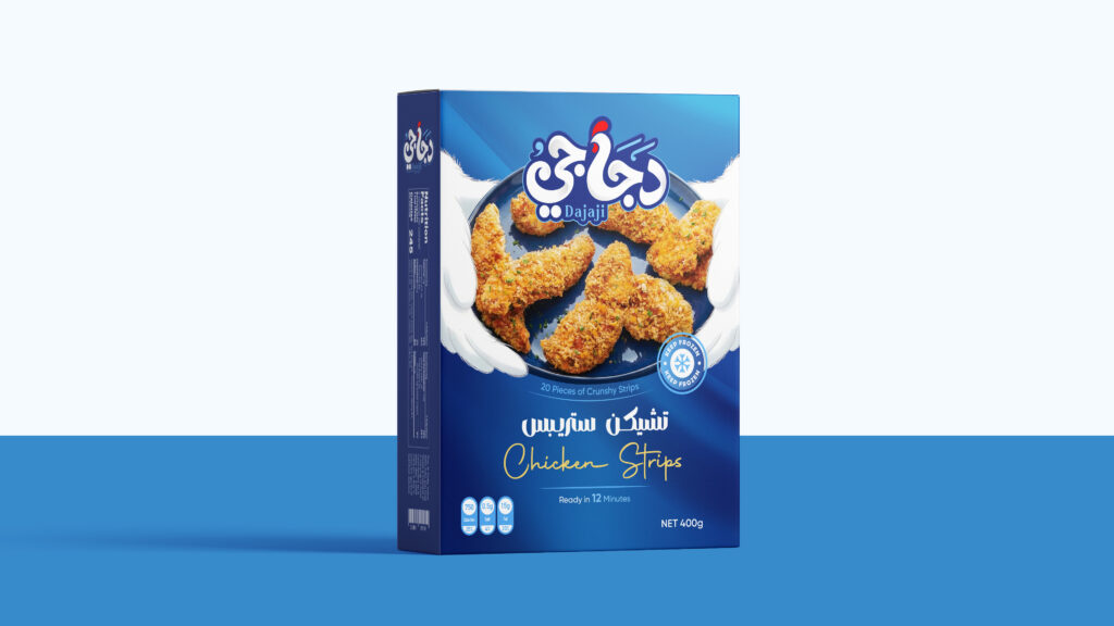
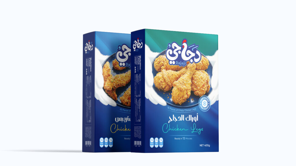
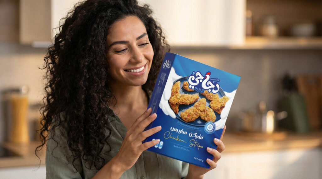
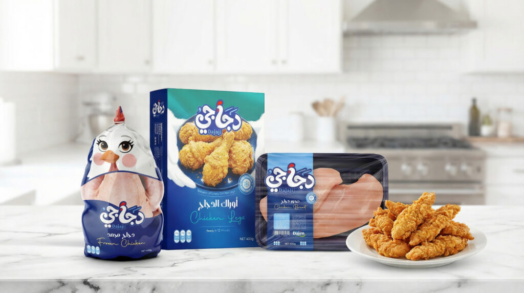
We also developed a flexible packaging identity that works seamlessly across the entire product range from fresh and frozen chicken to ready-to-cook products.
To maintain consistency while helping customers differentiate between variants, we used high-quality, appetizing food photography and introduced subtle color changes in the upper section of each package.
At Lasheen, we’re not simply trying to create beautiful designs.
We’re building brands with personality.
Because great branding isn’t just about how a brand looks.
It’s about creating an identity people remember.