When Wedyan decided to grow their brand, they came to Lasheen .
Wedyan , an ambitious agricultural investment company , was looking for a visual identity that could plant trust and harvest a lasting impression.
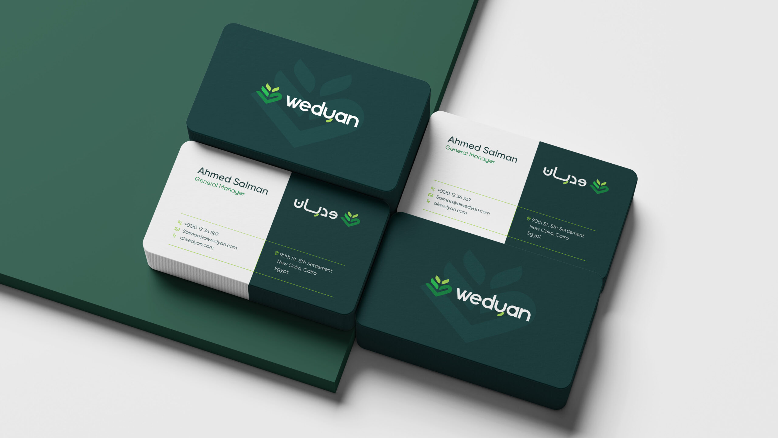
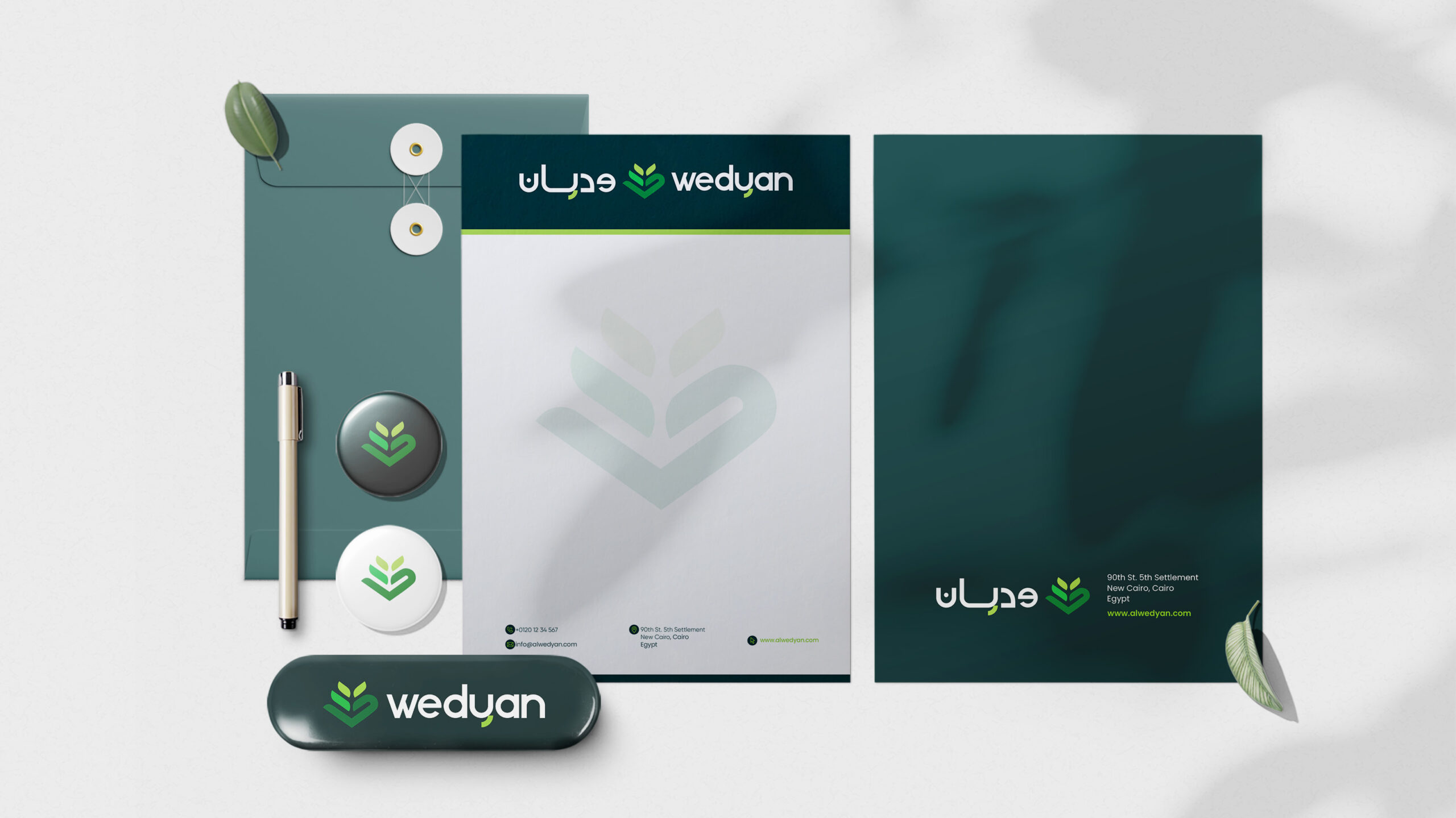
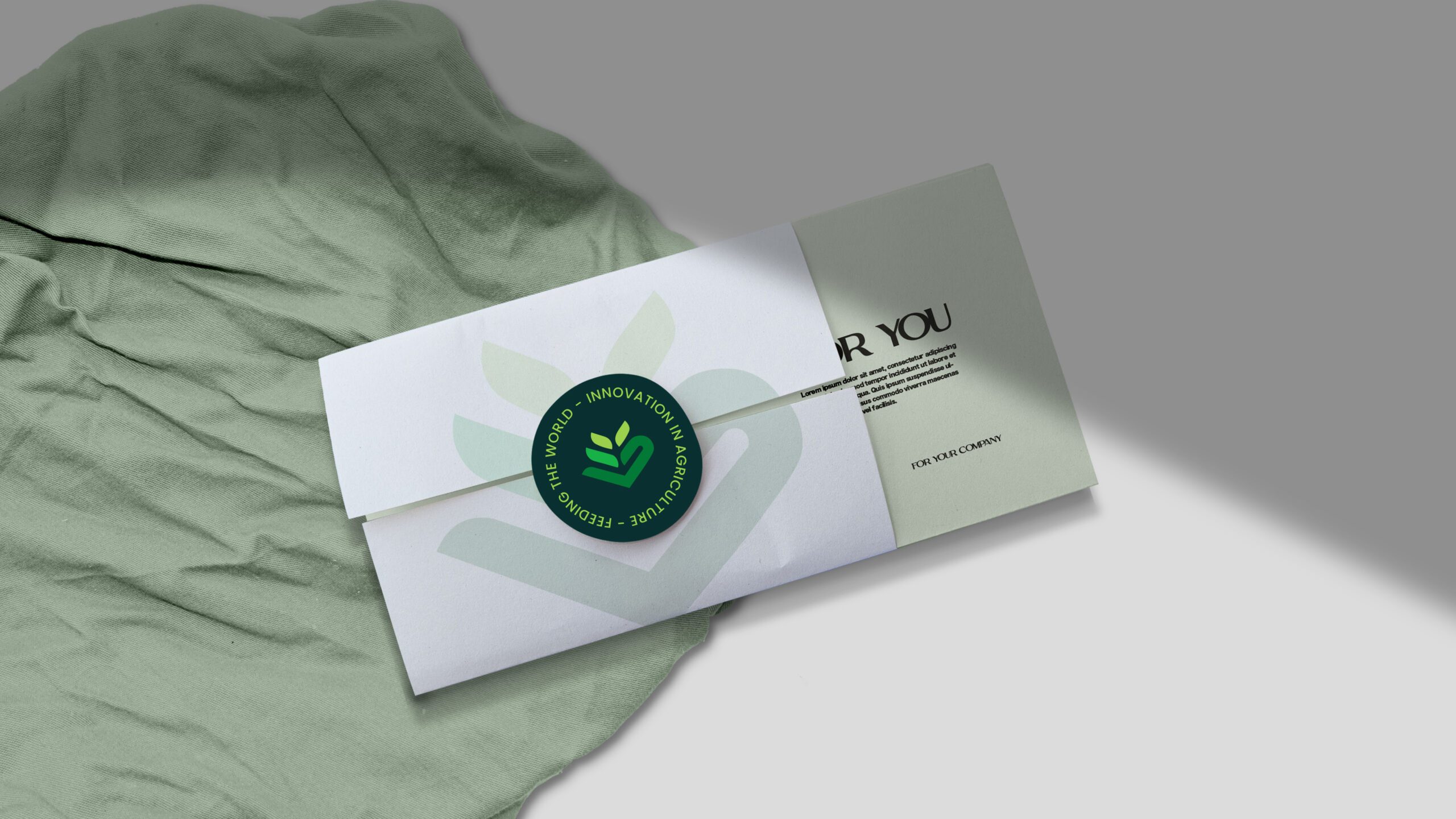
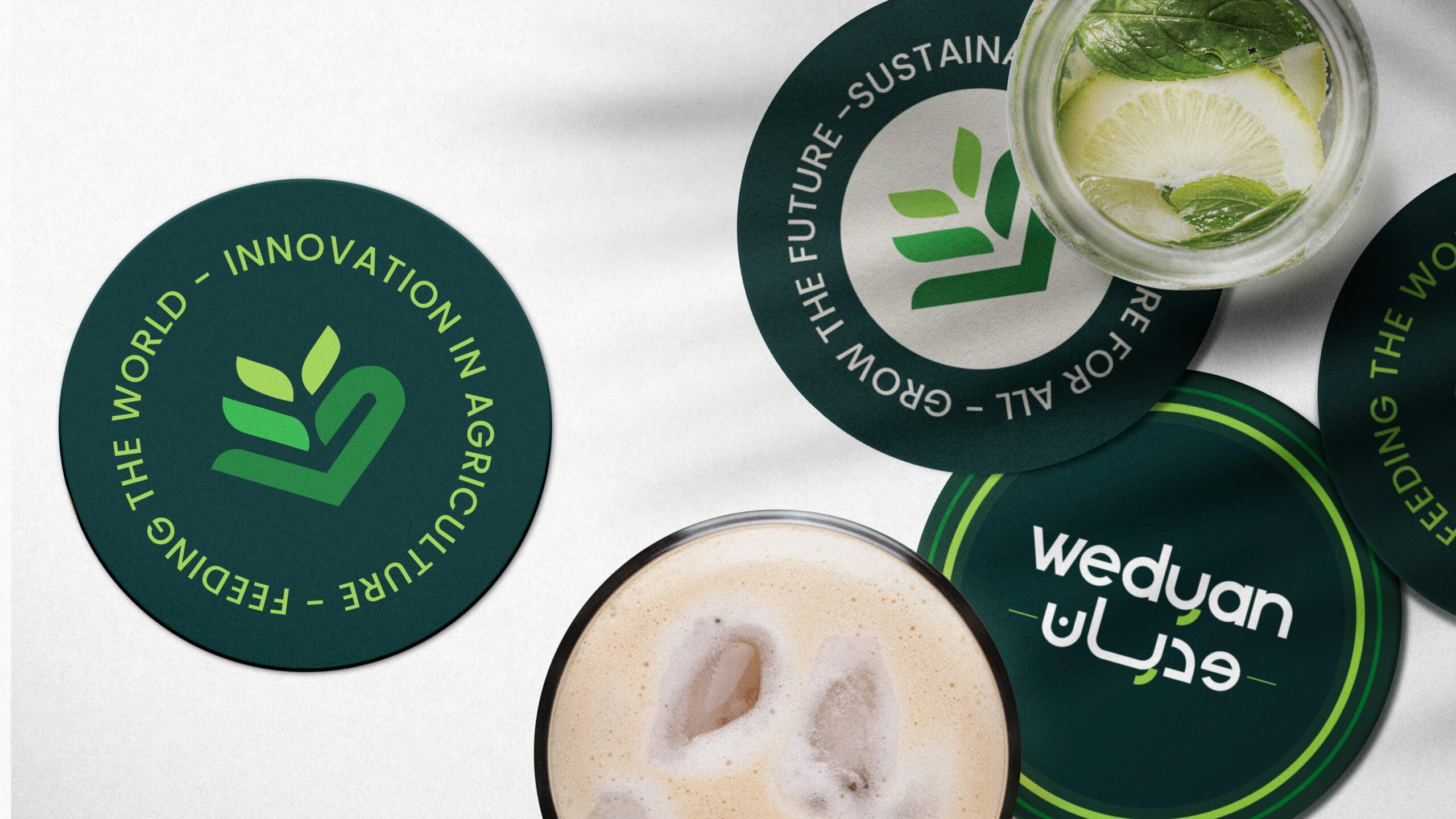
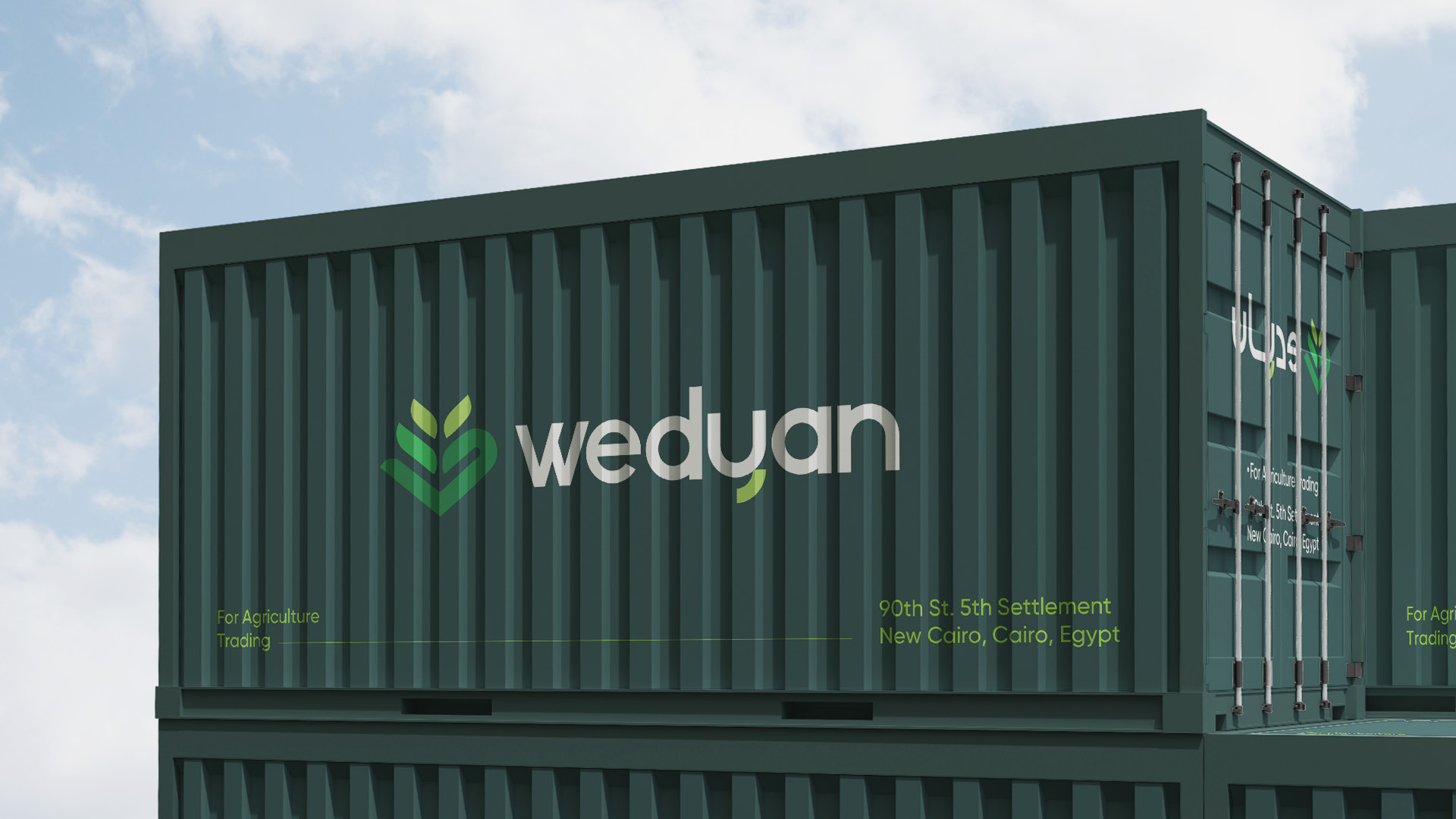
From the very first dot in the logo to the final detail in the visual branding system, we crafted a complete identity that reflects their mission: reclaiming land, cultivating crops, and exporting quality produce to global markets.
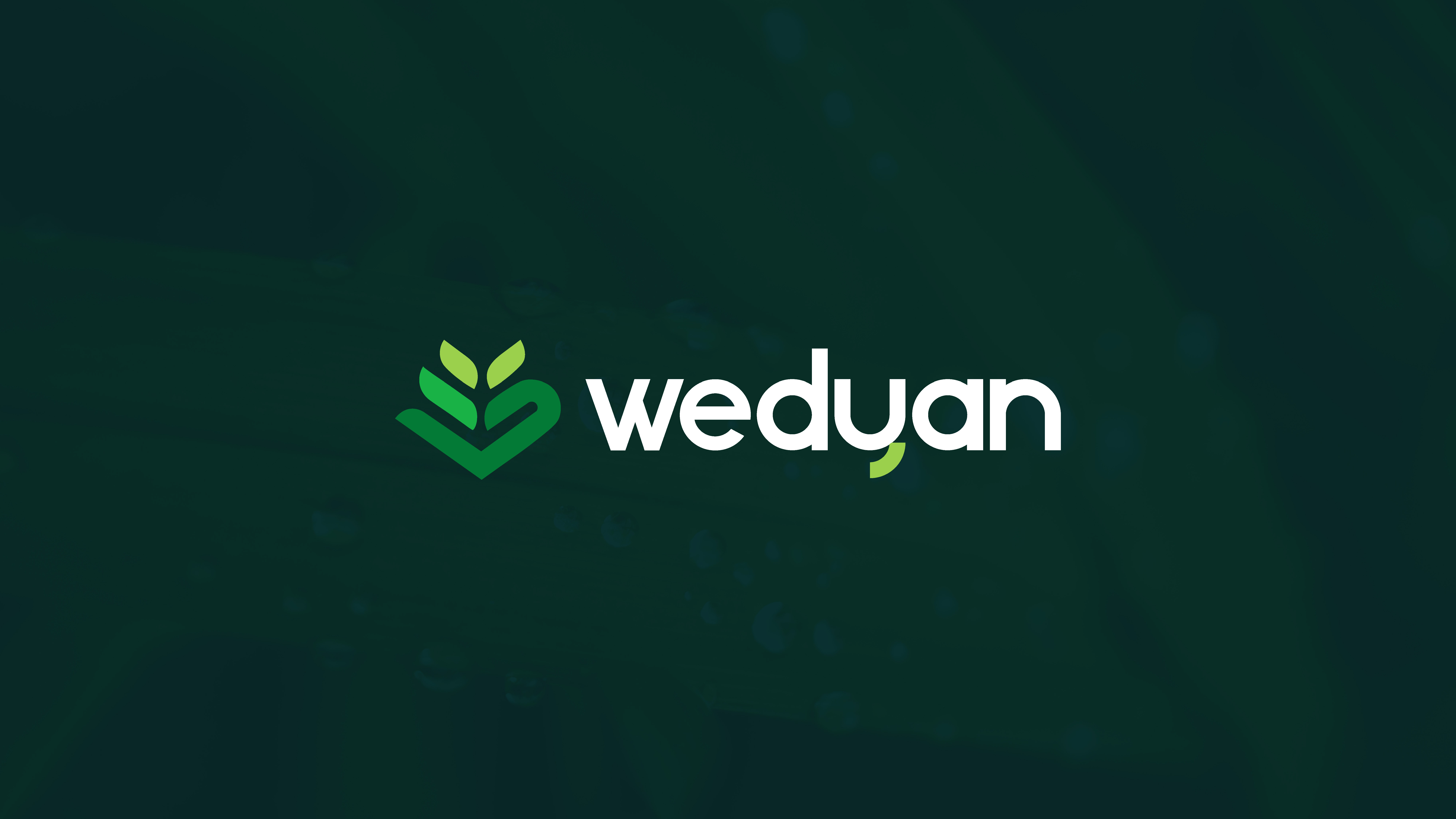
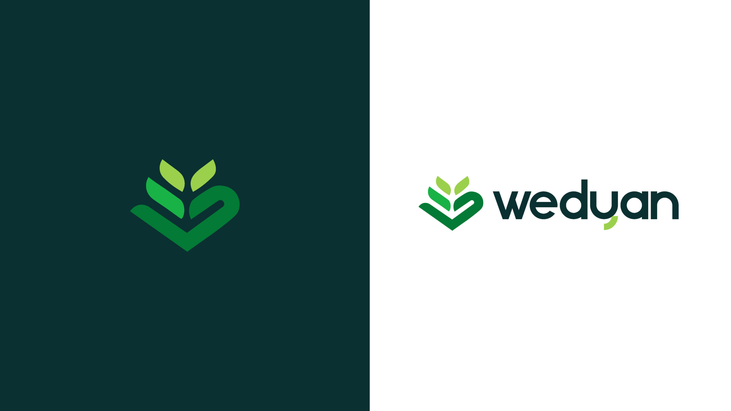
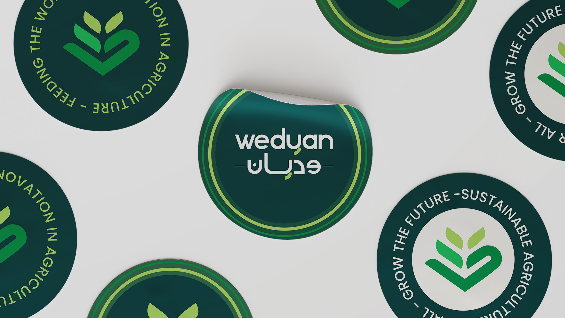
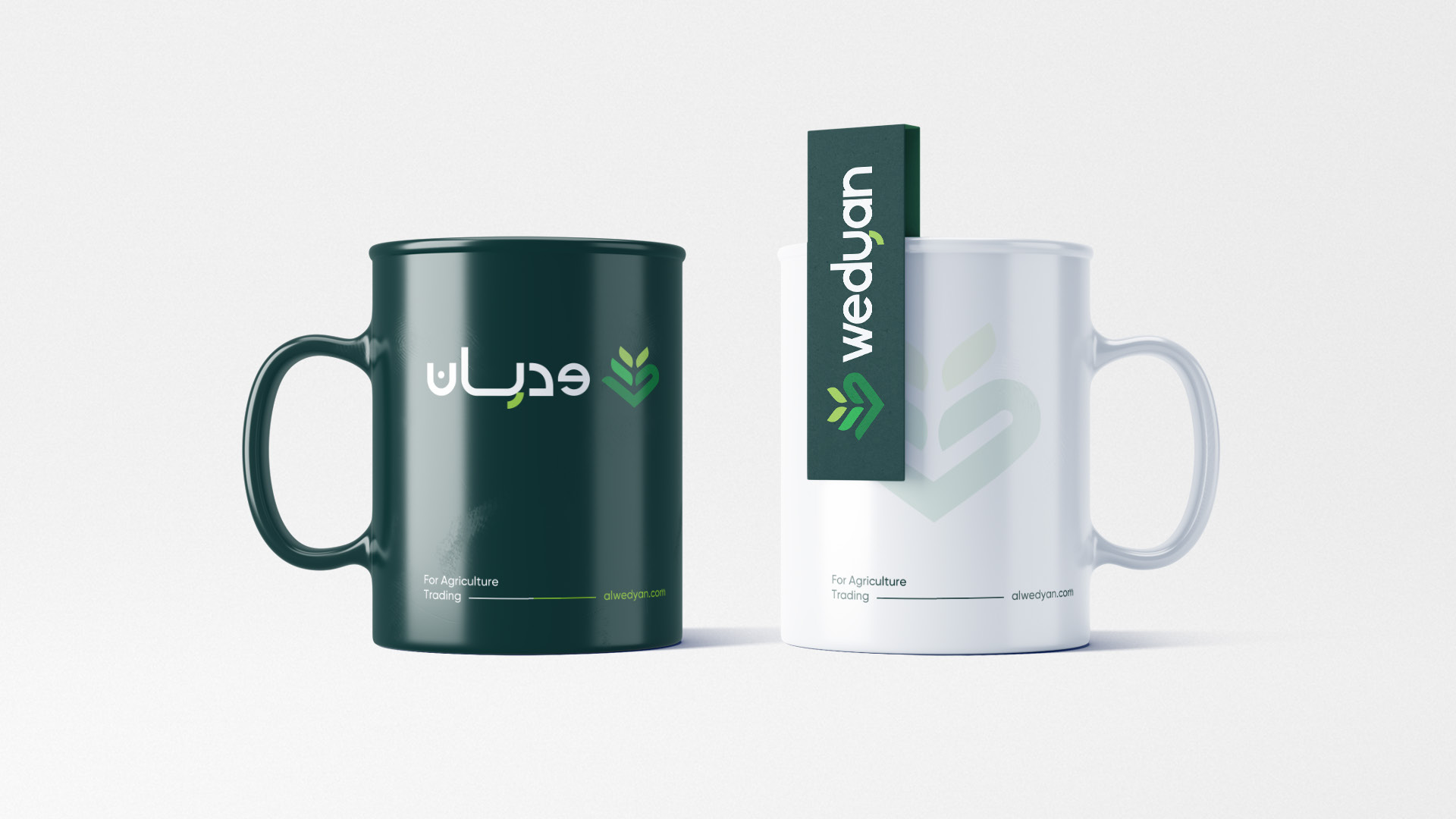
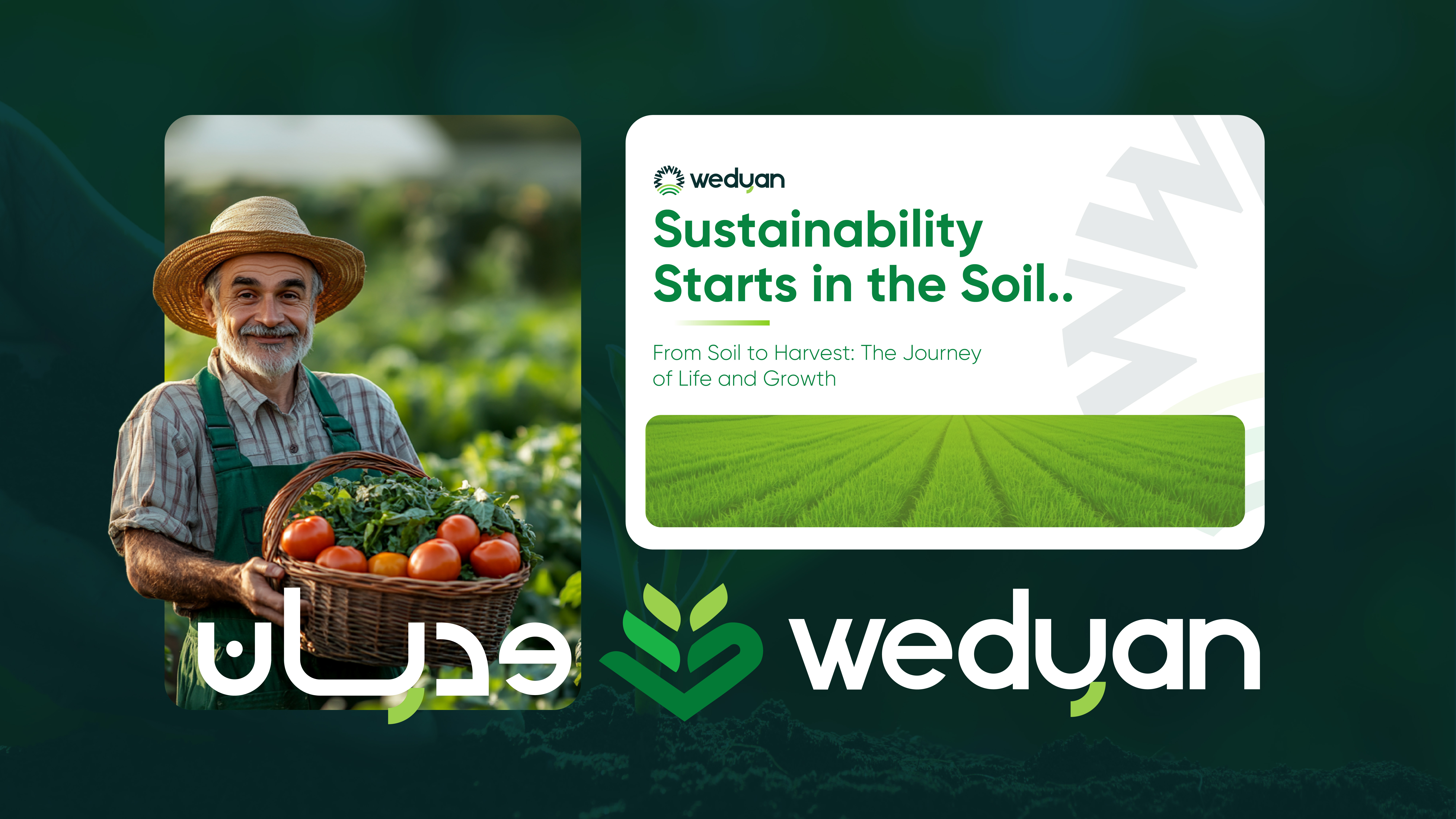
We designed two balanced logo versions (Arabic and English )with consistent font proportions and a clever link between the Arabic “ي” dots and the curve of the English “y.”
We also created a bespoke icon that merges the first letters of both languages (W and و) into a single leaf symbol , a visual metaphor for growth.
The green tones? Handpicked to reflect life, agriculture, and sustainability.
And this is just the beginning…
Watch out for Wedyan in global markets.
And stay tuned – Lasheen is just getting started.
