Gioia Rebranding
Evolving a familiar identity while preserving what makes it iconic.
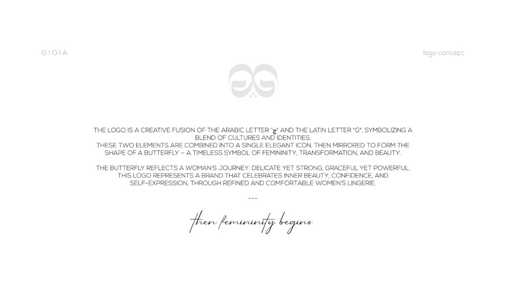
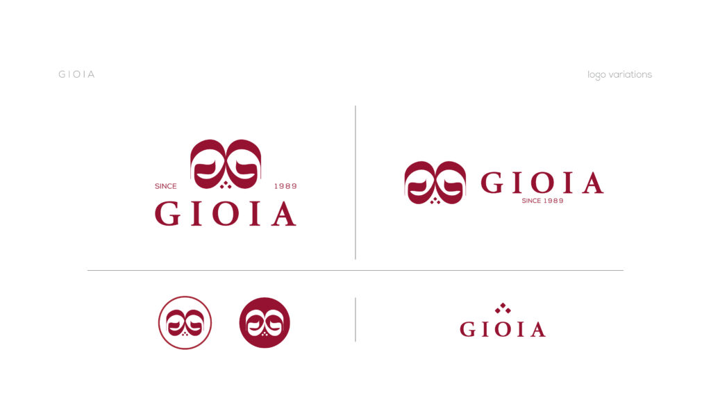
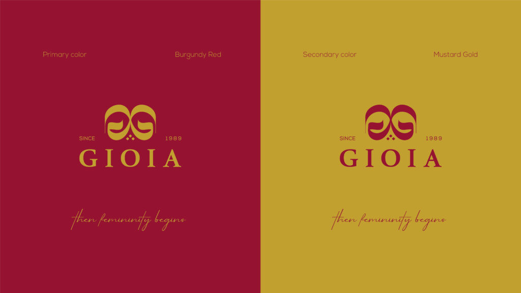
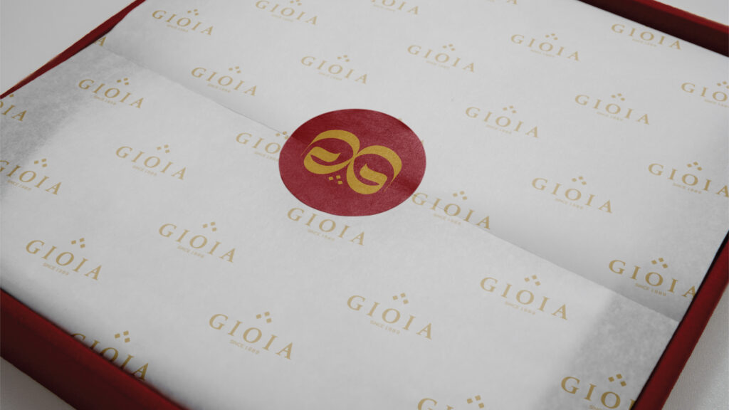
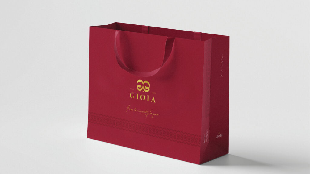
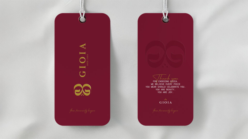
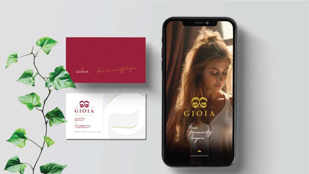
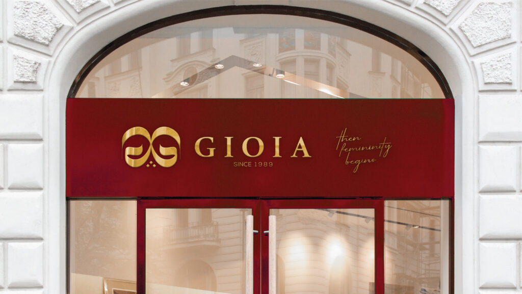
For Gioia’s rebranding, we refined the brand’s visual identity with a fresh, more contemporary approach transforming the butterfly symbol into an integral part of the G letterform.
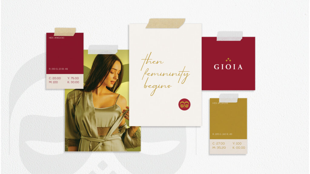
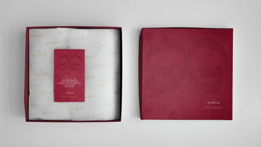
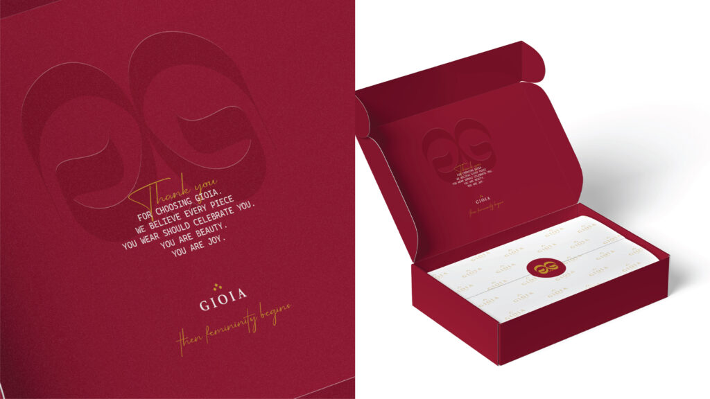
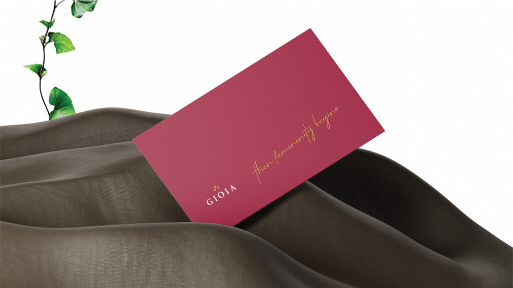
We preserved Gioia’s iconic Red, while introducing Gold as a premium visual element to distinguish and elevate the Premium Line.
From the logo evolution to the overall visual direction, every detail was designed to communicate one feeling:
Comfort you can see