When there’s a real intention to scale, the foundation has to be built right from day one..
Our client in Jordan was launching a domestic shipping & logistics company, with a clear vision to expand into the UAE, Syria, and Turkey. That meant building a brand that could grow without the need for future rebranding.
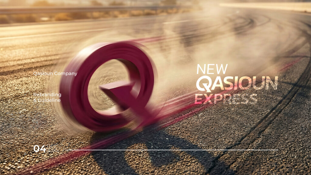
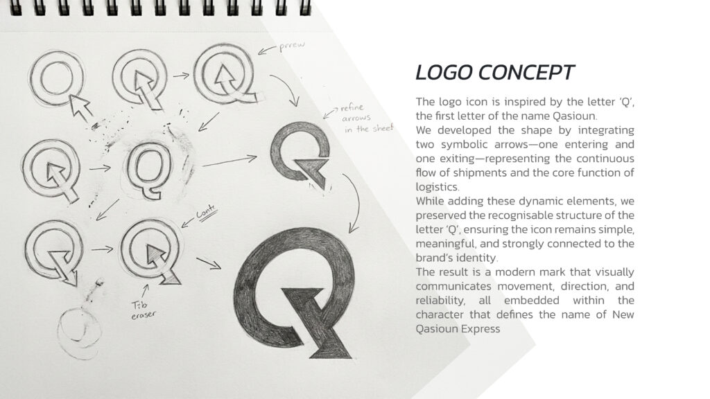
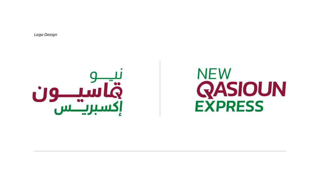
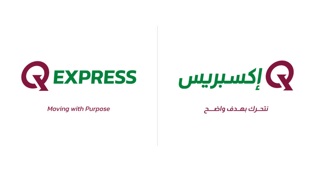
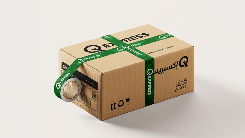
At Lasheen Branding & Packaging, we developed a strong, flexible Visual Identity. We chose the letter “Q” as a core icon representing Q Express a name that moves بسهولة across different markets and is easy to recognize.
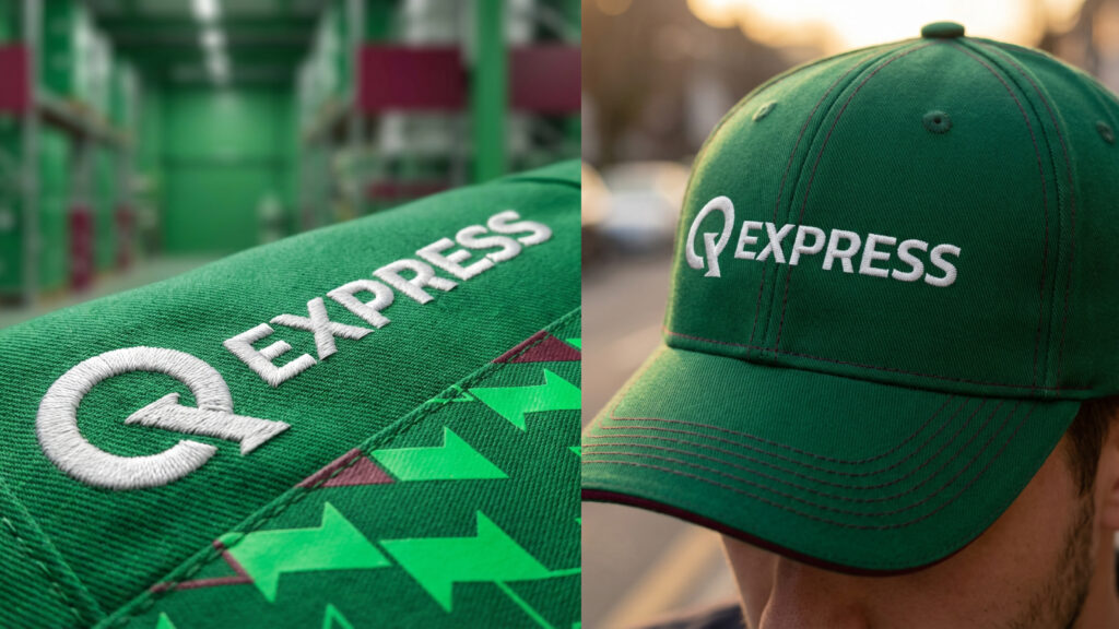
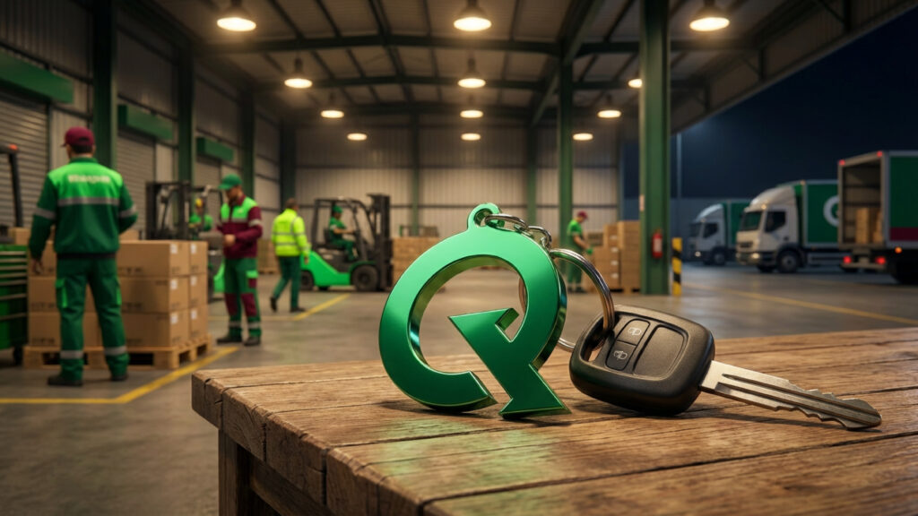
We evolved the “Q” beyond just an initial by integrating a double arrow, symbolizing speed, motion, and direct delivery making the logo itself communicate the service.
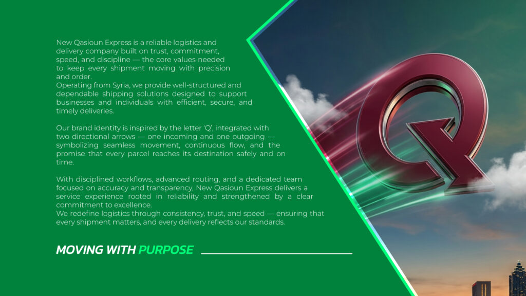
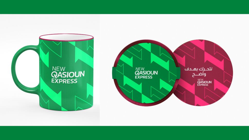
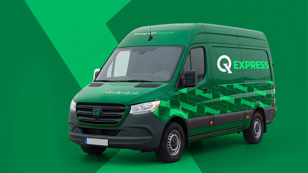
The green & burgundy color palette was carefully selected to reflect trust, professionalism, and stability the core values of the brand.
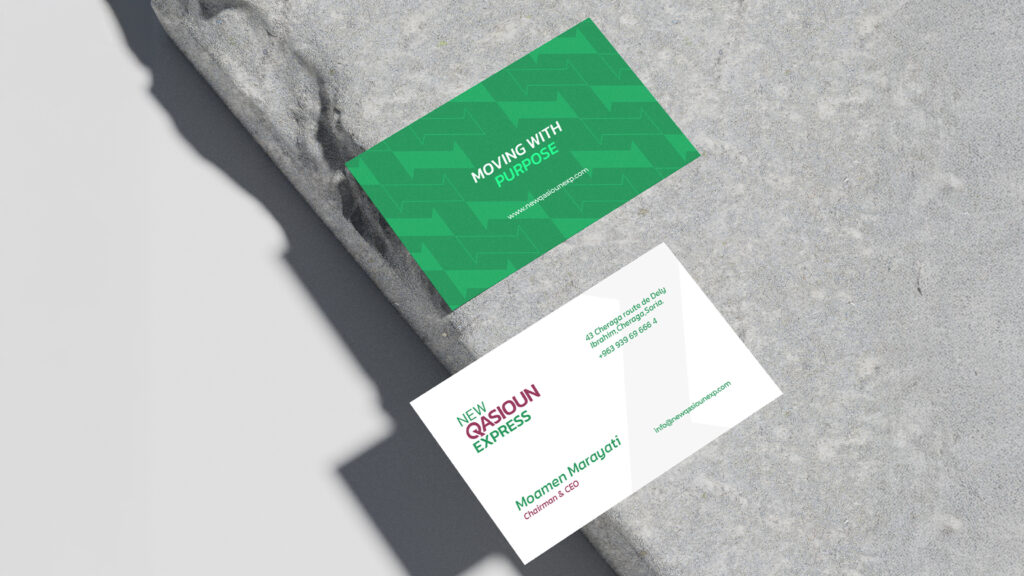
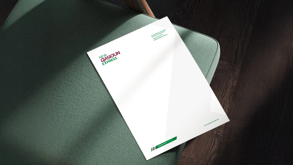
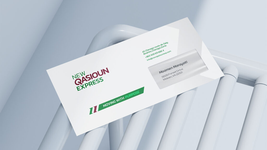
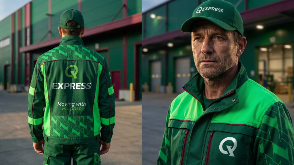
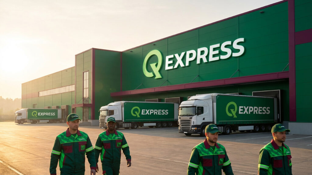
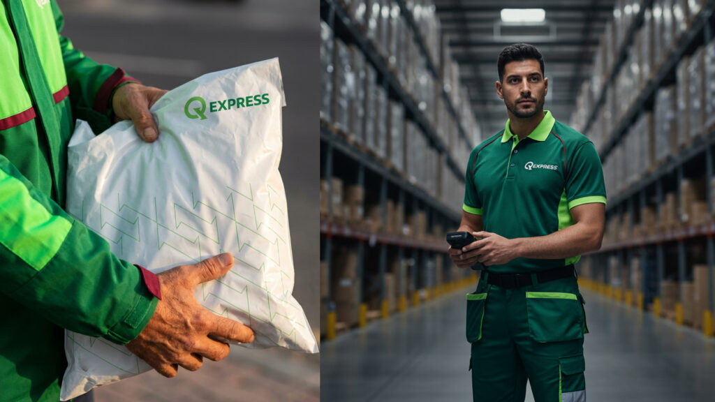
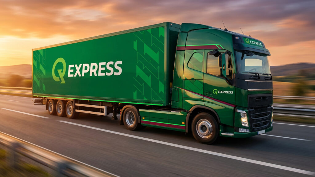
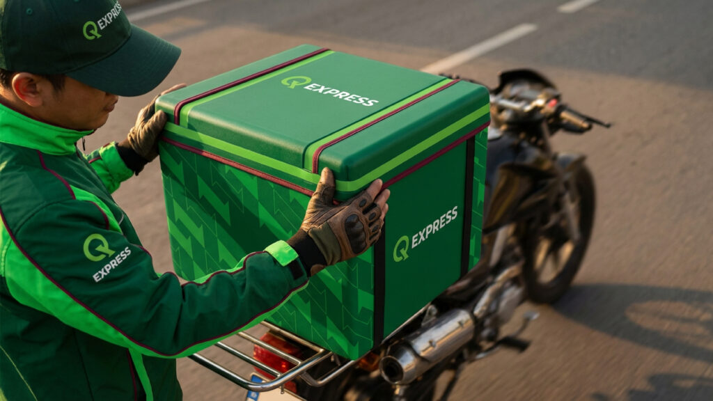
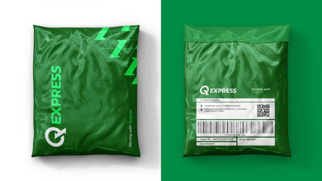
Then we rolled out the full branding across all touchpoints: from stationery and packaging to uniforms, warehouses, and delivery trucks ensuring a consistent and powerful brand presence.
At Lasheen, we don’t just design visuals — we build brands ready to scale across regions without losing their strength.
Slogan: Moving with Purpose