From the moment we received the brief for Shrips, our vision at Lasheen was clear:
A simple brand that is easy to notice, yet difficult to forget.
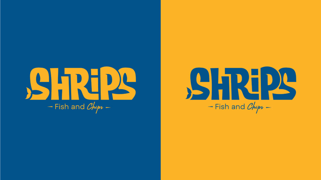
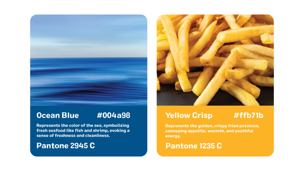
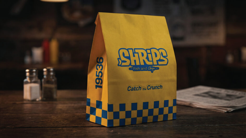
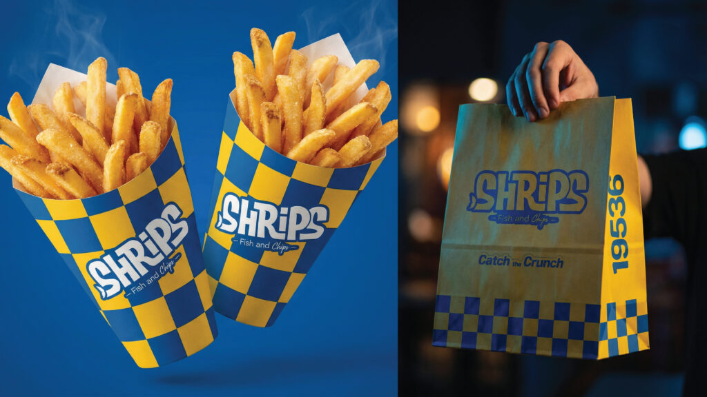
Since Shrips is built around a seafood experience with a stronger focus on express and fast food service, we decided that the core color palette should come directly from the experience itself. Blue was inspired by the sea, while yellow was inspired by one of the brand’s most important menu items fries.
But these are not just any fries. They are a special Shrips recipe, which inspired us to integrate their spirit into the design itself.
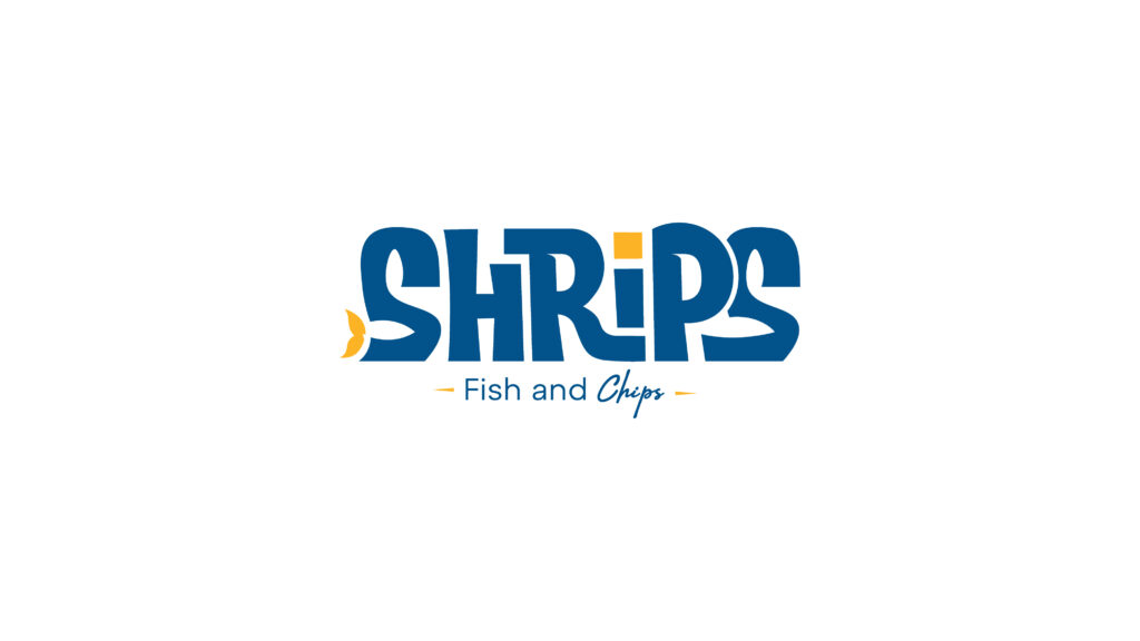
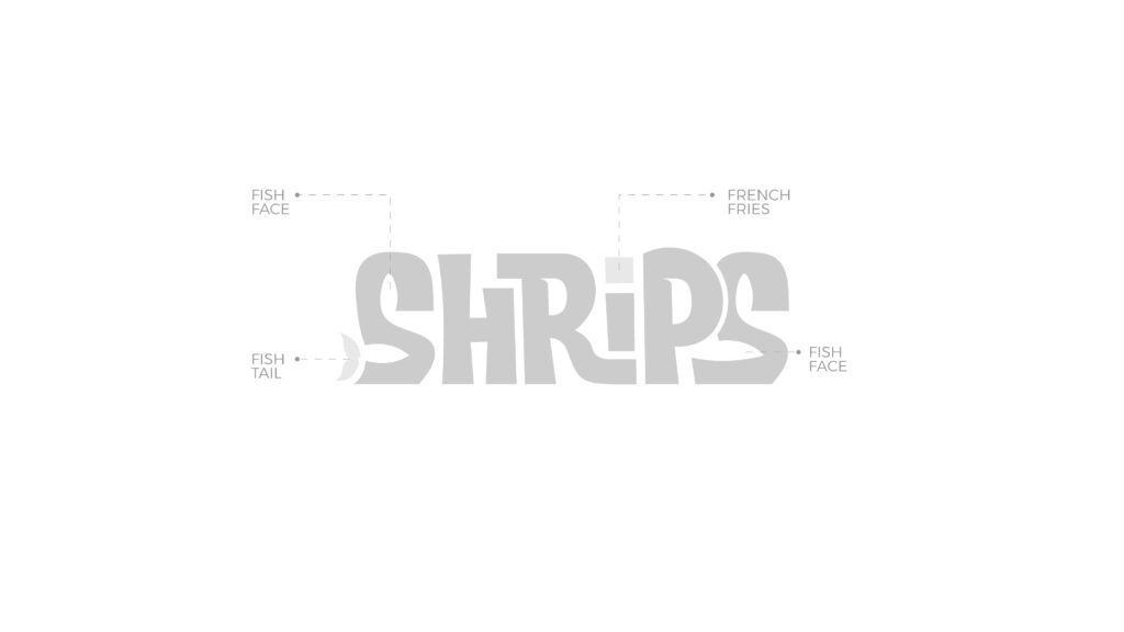
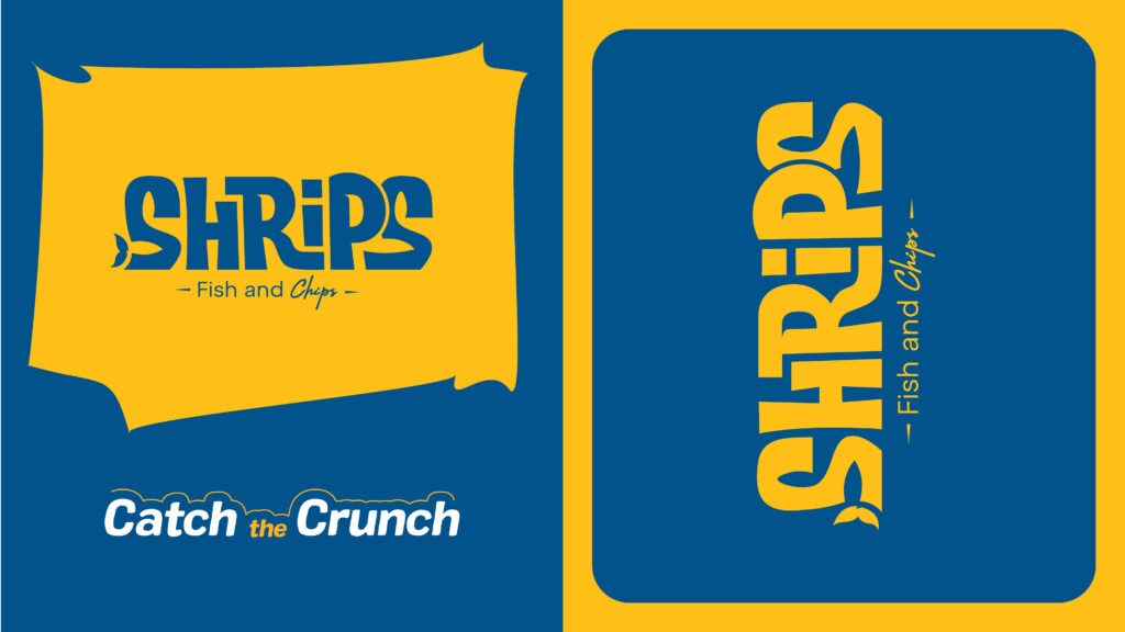
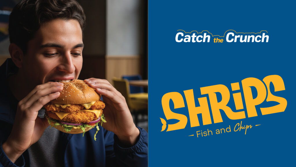
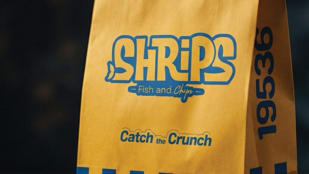
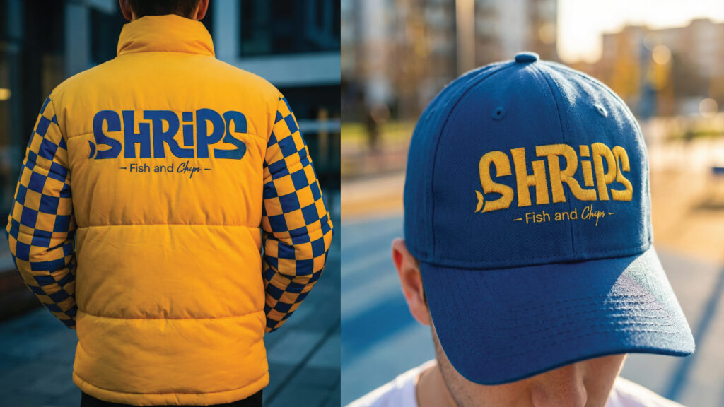
We created a bold and distinctive logo with a custom-drawn character and worked on the letter “S” to combine the shape of a fish’s head and tail. The dot of the “i” was designed to resemble a french fry, serving as a subtle detail that strengthens the brand personality.
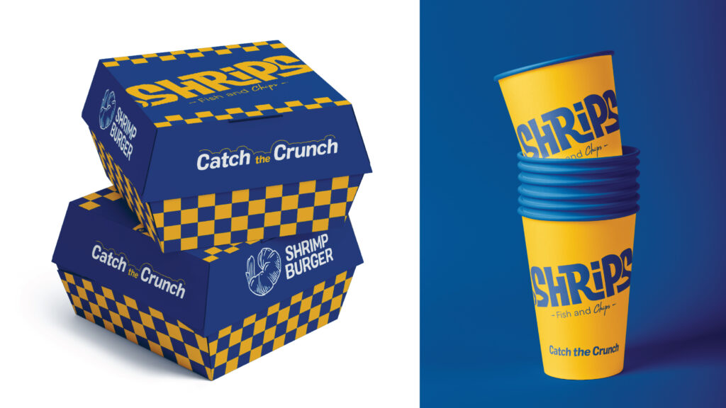
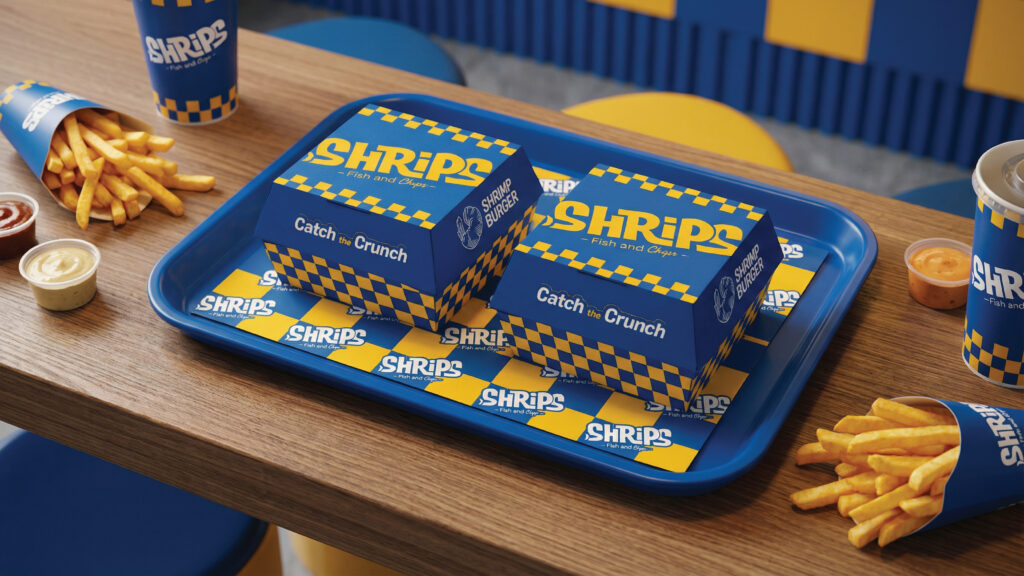
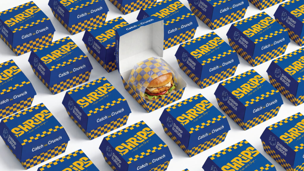
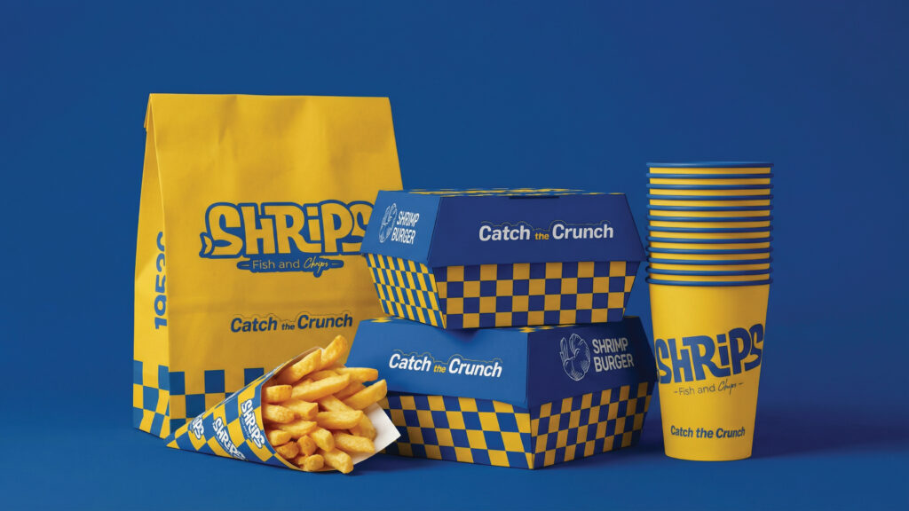
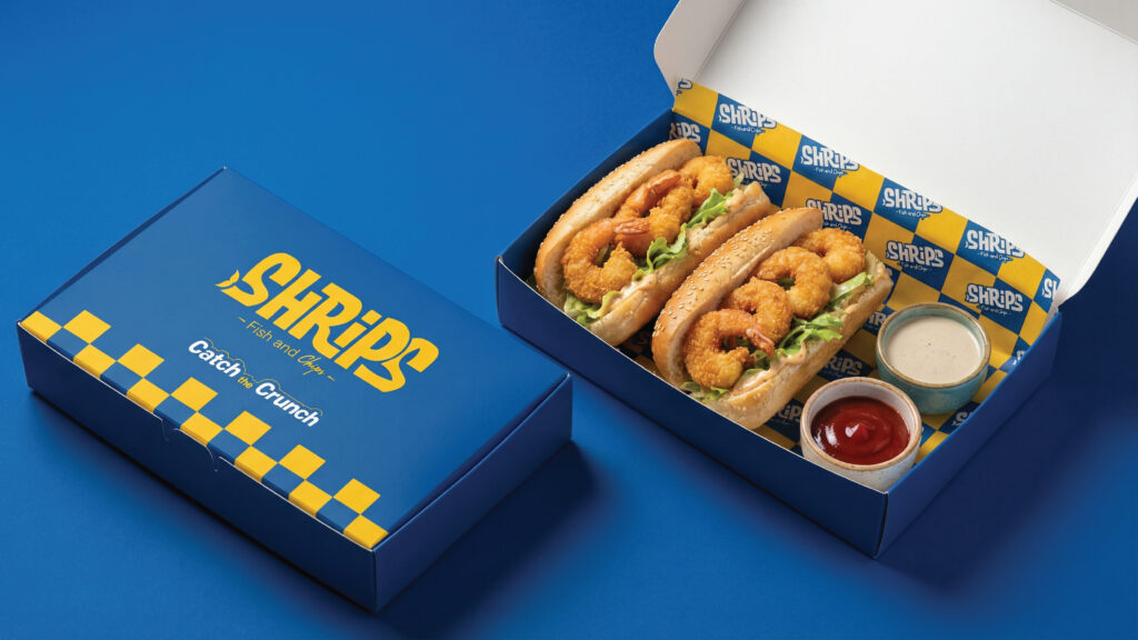
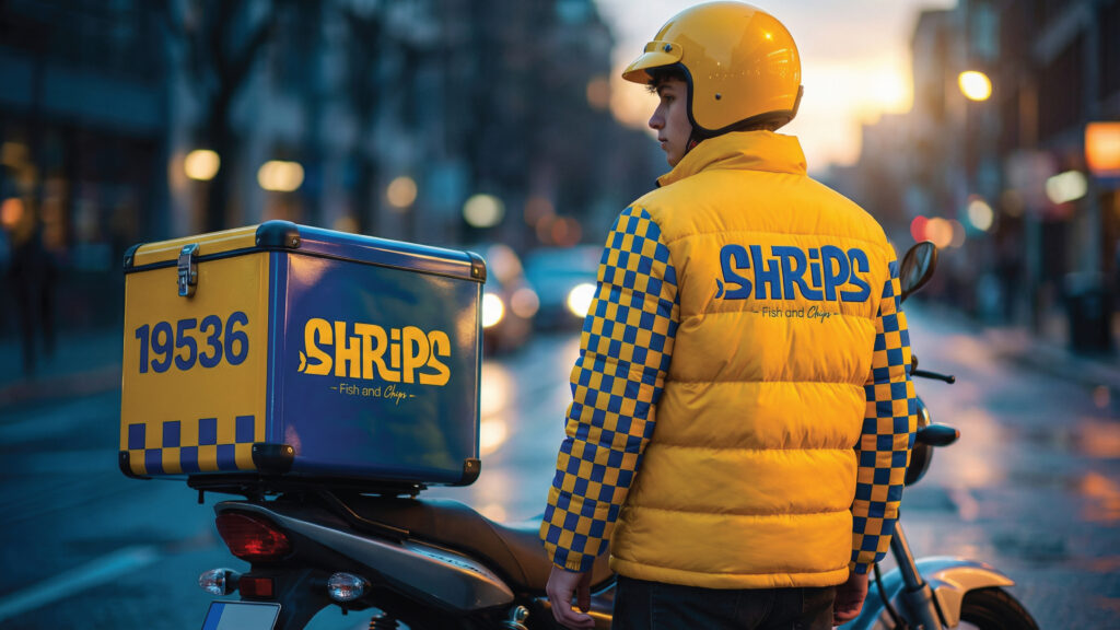
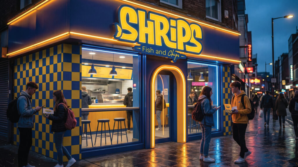
For the visual branding, we developed a simple pattern based on the interaction of blue and yellow squares, making it easy to remember while remaining visually impactful. The pattern reflects the feeling of crispy Fish & Chips, one of the key elements that defines the Shrips experience.
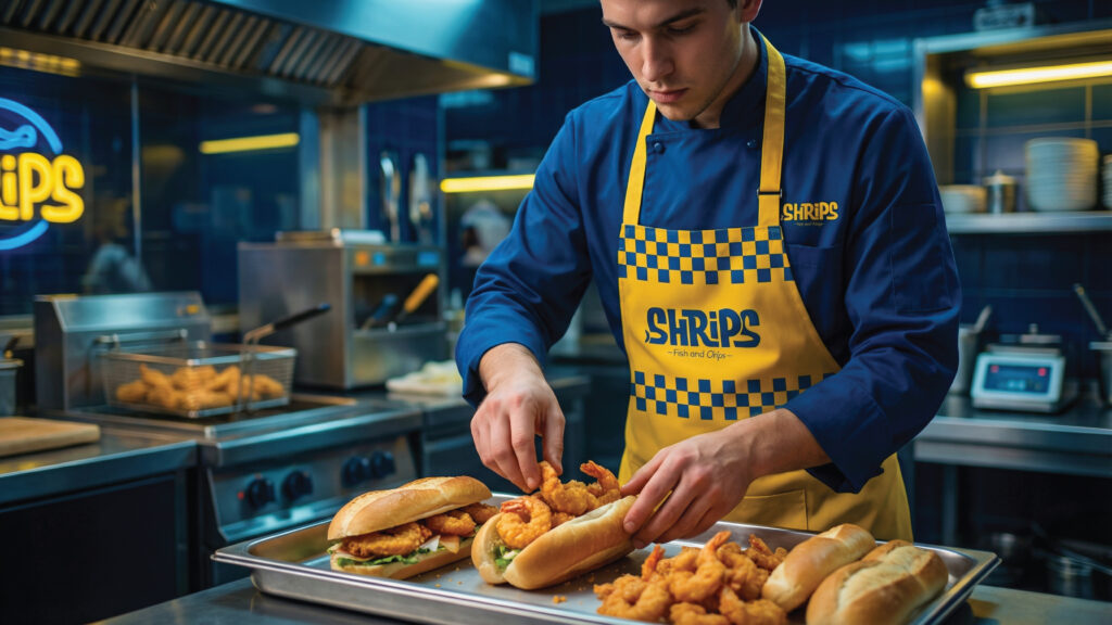
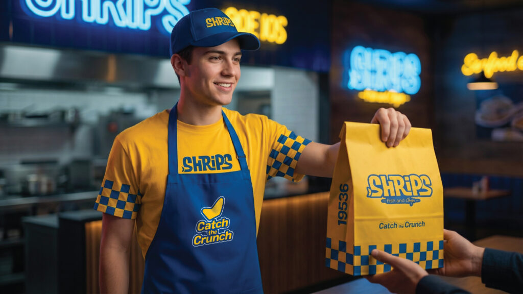
We then applied the concept across all brand elements, including packaging, uniforms, and signage. We also created a mood board to visualize the space and help the interior design team maintain the same brand spirit throughout the execution phase.
This was the final result for Shrips:
An Egyptian brand from Alexandria, inspired by the sea and built around a personality that is hard to forget